this post was submitted on 29 Jun 2023
103 points (99.0% liked)
Memmy - An iOS client for Lemmy
2536 readers
1 users here now
founded 1 year ago
MODERATORS
you are viewing a single comment's thread
view the rest of the comments
view the rest of the comments


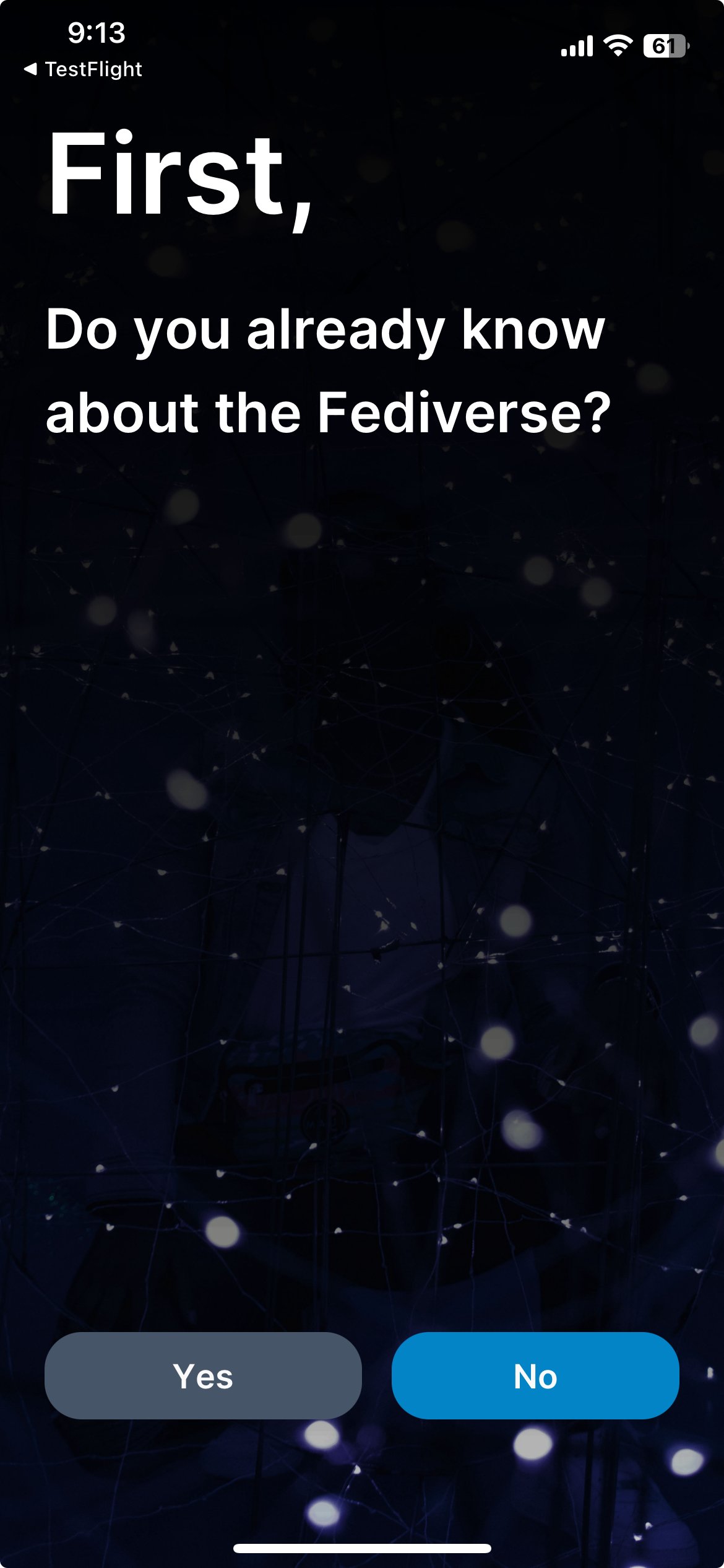
Yup, this is in the latest build. I’m planning on having the instance selection be available in the account screen in the future, although I called it hubs to make it more user friendly.
The whole idea of it was to be hopefully easy to understand for new users whilst having functionality that veterans would enjoy. Newbies will hopefully appreciate the guide and veterans should appreciate the instance selection for new and old accounts.
The background is just something I grabbed quickly from Unsplash. I’m planning on changing it in the future to something more appropriate. It was originally just supposed to be a placeholder :P
I’m quite pleased with how it’s turned out but I’m always looking for feedback on possible ways to improve it or things we should do differently.
The main focus of the redesign and the rebrand was to make things more user friendly and applicable to a larger audience. Hopefully this makes it much easier to bring new users over to the Fediverse!
I REALLY like the idea of walking people through a little story. Smart.
That said. The language was confusing for me. Talking about ”centralized” and “hubs” didn’t really click for me. I view hubs as the center of something.
I dig where you’re going! This is just one dumb dumb’s interpretation of the copy. 😆
Haha yeah, I get what you mean. The issue is trying to explain these things within my self-imposed limit. I wanted it to be less than 5 pages and under 200 words.
Unfortunately corners do have to be cut somewhere to achieve that. It’s something that’s quite complex to explain and I think I did an okay job. When it comes to terminology, I think hub is much better than instance. Centralised was one I dwelled on for awhile but I decided to leave it in the end as it provides a comparison to traditional social media platforms.
I think some illustrations would go a long way as well with it, but my illustration skills are practically non-existent. I can do UI and UX but not illustration :P
The idea of it wasn’t to be a detailed guide on it, it needed to be quick and simple. I’m planning on having some kind of knowledgebase in the future, which will give more guidance, information on terminology and inner workings. It’s something that I definitely want to do but it’s not in focus at the moment.
For now, I think it’ll be a helpful guide. I’m sure it’ll change in the future and I’ll be surprised if it didn’t. As the saying goes, if I had more time, I would’ve written a shorter letter. I’m pretty sure I’ll write a shorter and better explanation in the future. Hopefully sooner rather than later :P
I feel ya. I’m a UX designer, and sometime the copy writing / content strategy part of the gig is actually the hardest part. Especially with something nebulous like this.
You’re totally going in the right direction! I say get v1 out, take advantage of that Reddit migration wave next month, see what the new users say, then see where you need to iterate.
Keep up the good work. A tutorial is 100% the right thing and a smart move. Bravo!
One note: rebranding instances as hubs is going to confuse new people, because the term “hub” isn’t part of the ecosystem vernacular, and they aren’t going to find that term anywhere else as they build their understanding of the system.