this post was submitted on 26 Jun 2023
6 points (100.0% liked)
Colorado Avalanche
154 readers
1 users here now

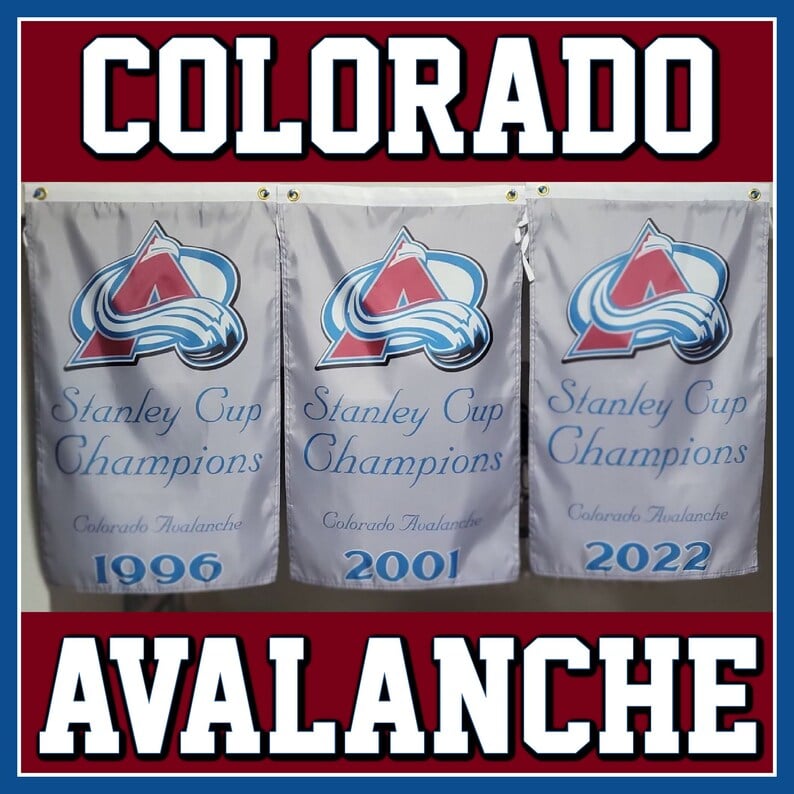
A community for all things related to the 1996, 2001, and 2022 Stanley Cup Champion Colorado Avalanche NHL hockey team.
Rules:
- Be excellent to each other
- Post relevant content
- No spoilers in title, mark spoilers
- No spamming or trolling
- Only relevant posts
- Let people like what they like
- Follow all Lemmy.world rules
Please report any rule violations.
founded 2 years ago
MODERATORS
you are viewing a single comment's thread
view the rest of the comments
view the rest of the comments

I'd love to see the team go total redesign rather than dig up pieces of the past. When the Kraken unveiled their logo/uniforms I loved how they used the little bits of red accent as a "pop" contrast against the rest of the colors and I think it looks great on the ice. I was meh on this last year's Avs reverse retros design, but I LOVED how the yellow circle and bright red C of the main crest absolutely POPPED when they wore those kits on the ice. The burgundy and blue Avs colors just don't contrast each other enough, especially on TV, and the result is just kind of muddy blah.
If I was in charge of the Avs kits, I would choose a cooler (icy?) blue as the primary color and utilize some sort of intensely contrasting accent color. If Howler and a Yeti foot can fit into the new scheme then have at it!
Thanks for the thoughtful response! The Nordique alternates from a couple seasons ago had some of that 'icy' blue and I wouldn't mind that with the burgundy for sure. I'm honestly fine with Howler not coming back and have made peace with the foot likely never appearing again on the main jersey. However, I long for the day where one season's alternate jersey features the foot front and center on the front. I'd proudly wear one of those on a regular basis if they ever make something like it.