this post was submitted on 12 Nov 2023
26 points (100.0% liked)
Pangora
131 readers
1 users here now
🐝 An activitypub compatible forum and link aggregator. Downstream from Lemmy.
Info
Info
Pangora is the name of the lemmy soft fork thats being primarily worked on by members of programming.dev. Its aimed so that we can add features on top of lemmy and prioritize them based on what the instance needs while still being able to push changes upstream to lemmy if they accept them.
This also makes us more decoupled from lemmy so that if anything major happens to lemmy we can keep going with maintaining the site without any issues.
Credits
Credits
Icon base by Lorc under CC BY 3.0 with modifications to add a gradient
Pangora


Pangora-UI


founded 1 year ago
MODERATORS
you are viewing a single comment's thread
view the rest of the comments
view the rest of the comments


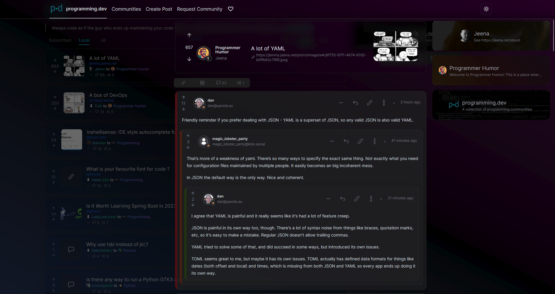
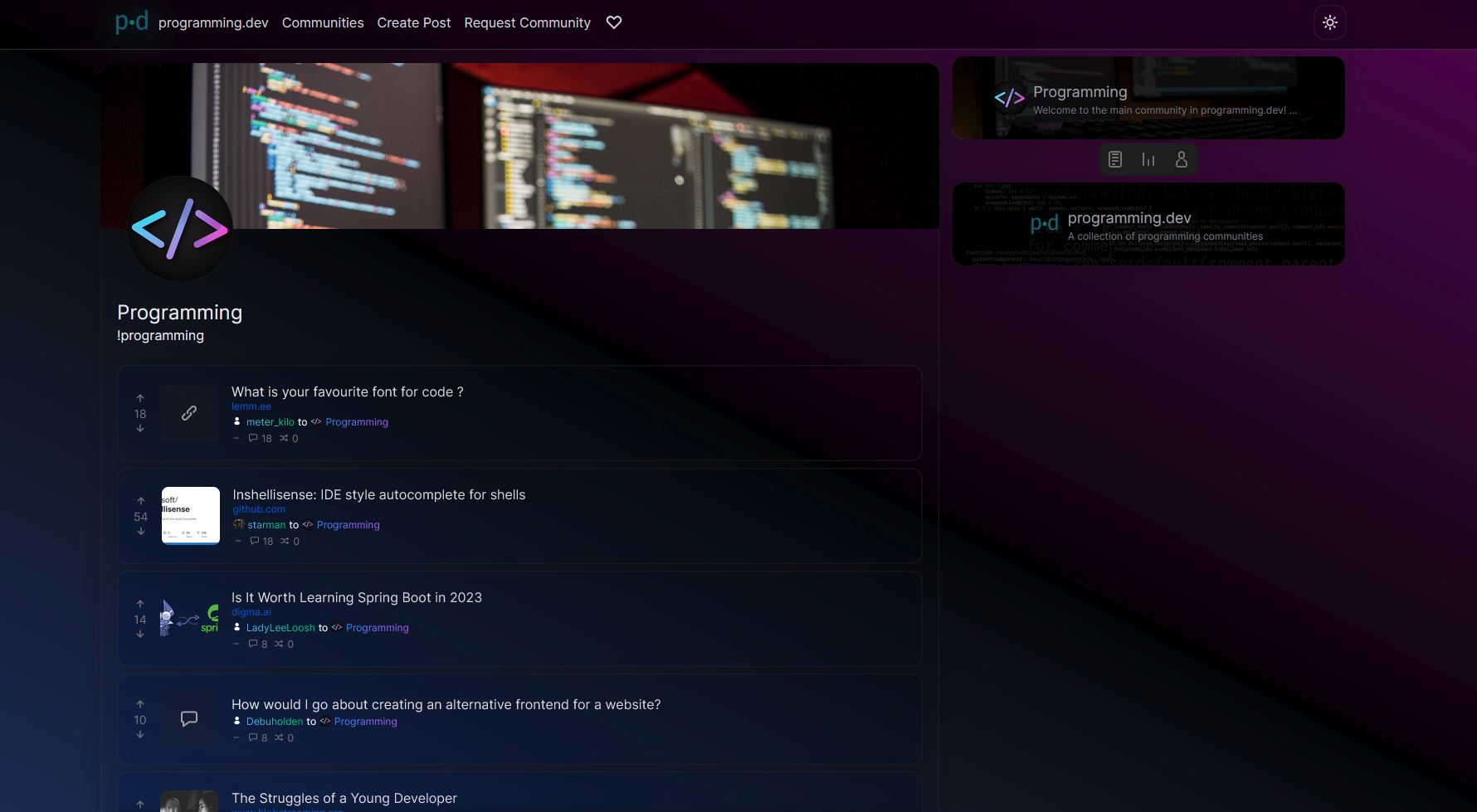
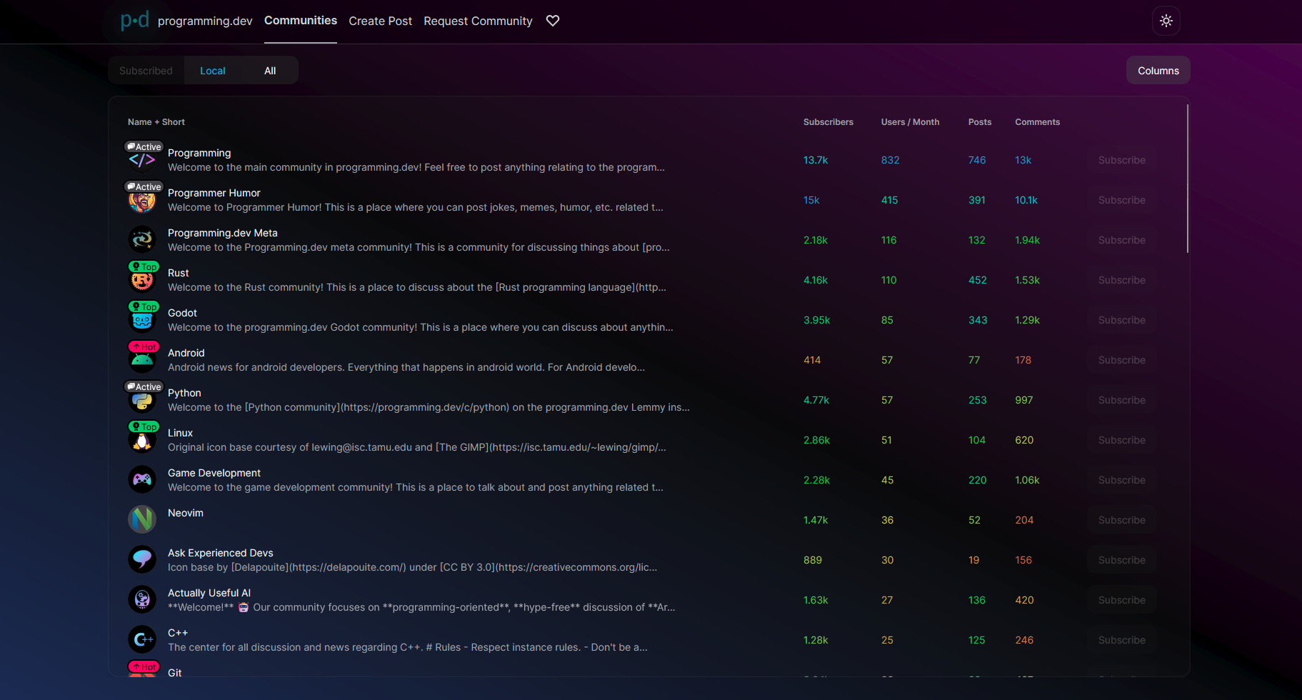
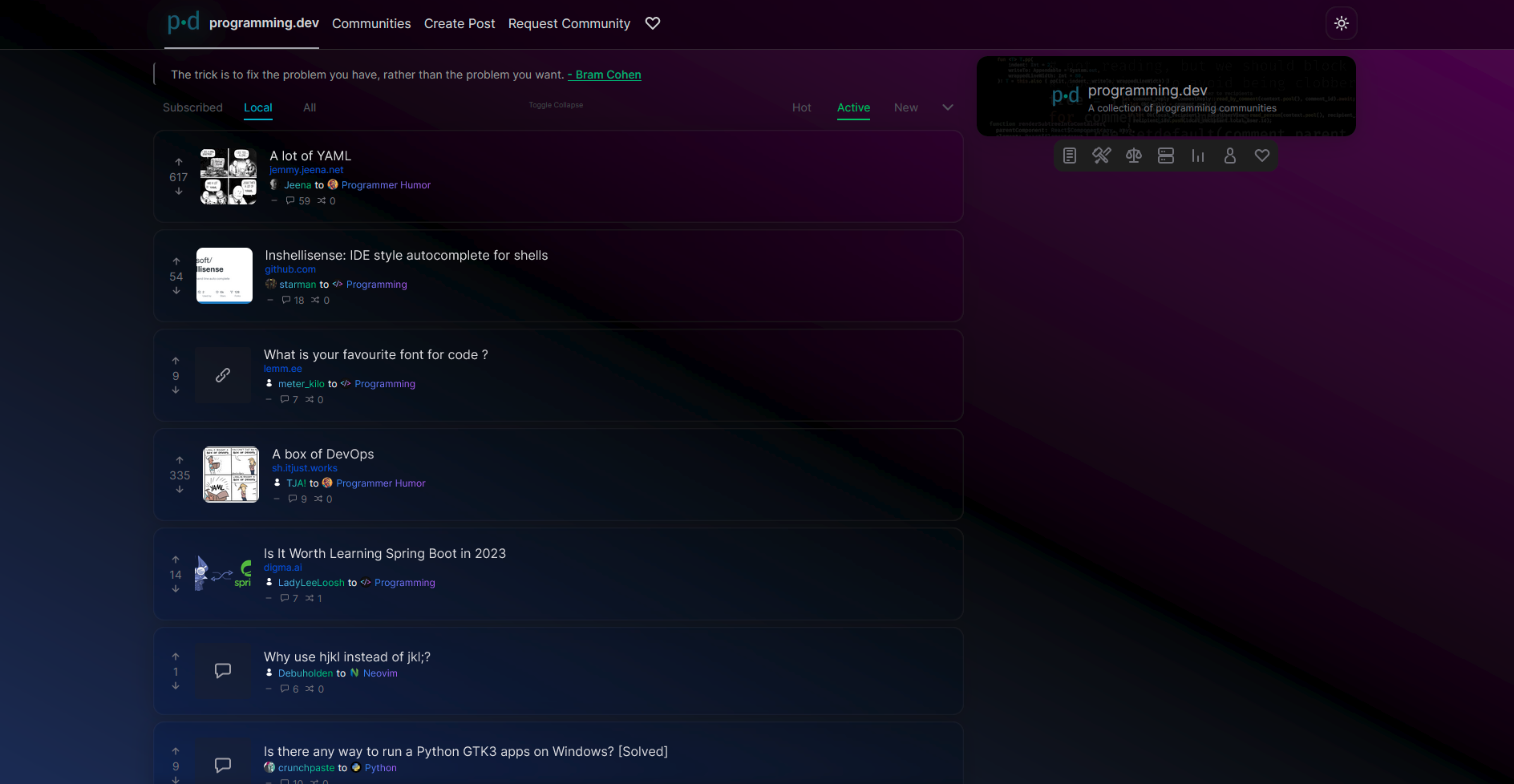
I think the gradient background is a bit too bright? I reduced the luminance for the colors down to 7% and I think it's easier to read, but I'm not a graphic designer at all lmao
also on light theme the posts have a different background color, outline, and shadow so they stand out well from the background, but on dark theme the post background is transparent so they don't stand out from the background at all, that might be a better fix than the CSS changes above
but again I'm not a graphic designer and I'm actually a fan of very plain readable themes
Yeah I reduced the amount of transparency on the post cards after this round of testing. Now only half transparent