this post was submitted on 17 Oct 2023
1685 points (95.0% liked)
Technology
59672 readers
4191 users here now
This is a most excellent place for technology news and articles.
Our Rules
- Follow the lemmy.world rules.
- Only tech related content.
- Be excellent to each another!
- Mod approved content bots can post up to 10 articles per day.
- Threads asking for personal tech support may be deleted.
- Politics threads may be removed.
- No memes allowed as posts, OK to post as comments.
- Only approved bots from the list below, to ask if your bot can be added please contact us.
- Check for duplicates before posting, duplicates may be removed
Approved Bots
founded 1 year ago
MODERATORS
you are viewing a single comment's thread
view the rest of the comments
view the rest of the comments

Spotify in on itself is worth paying for BUT...
Their app for android sucks blue donkey balls and I'd happily pay more if I'd get to use a slightly less retarded cousin of this app.
The other but:
Spotify in on itself is not very bad right now and basically could and SHOULD continue as-is forever.
However, the economic system as it currently is requires it to continually come up with new crap that nobody needs nor wants (see also all Microsoft software that went from absolute shit thirty years ago to absolute slimey shit with lots of useless but pretty ding dong bells attached to it with a nice camera hidden inside to spy on the insides of your butthole) and it only a matter of time before...
Some exec gets hired there that promises to double their revenue, then implements some shit that will double their revenue once, gets this exec his bonus upon which he immediately quits to go to the next company to fuck over with a pineapple, leaving Spotify with a huge exodus of users, a dwindling service, and two years later it's dead.
I've seen this cycle with too many large companies, and it's the same story over and over. Be it Boeing, Disney, just about all large game companies, etc etc..
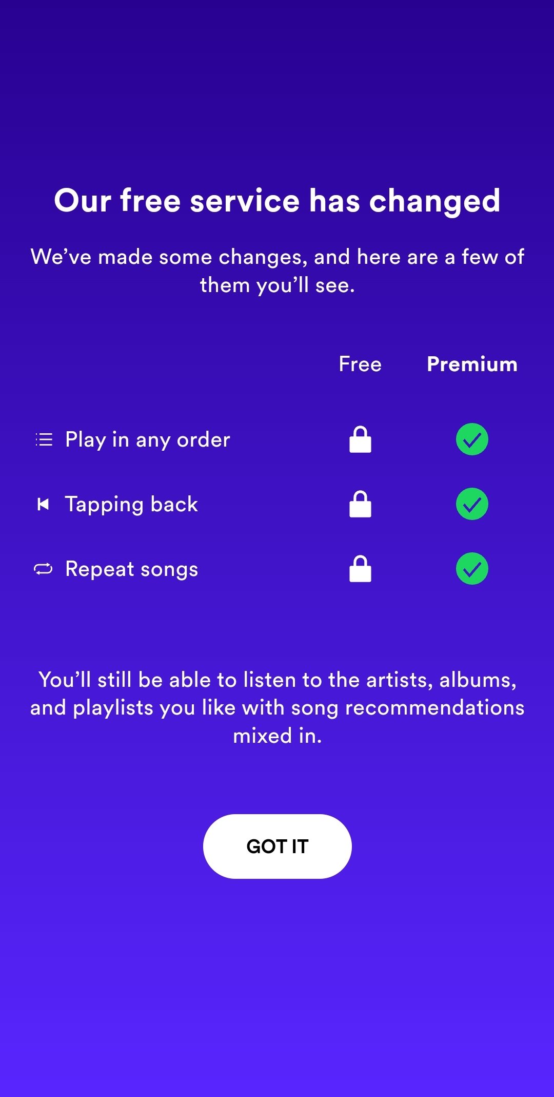
Spotify app sucks in the sense that they keep refining their UI to reduce the number of buttons on the bottom of the screen. When it first started they were five, then after a while there became four. I got used to where everything was, so of course with the recent update there now three so I have no freaking idea what is what.