this post was submitted on 27 Jul 2023
20 points (100.0% liked)
Typography & fonts
90 readers
1 users here now
A community to discuss and share information about typography and fonts
Sibling community:
Rules of conduct:
The usual ones on Lemmy and Mastodon. In short: be kind or at least respectful, no offensive language, no harassment, no spam.
(Icon: detail from the title of Bringhurst's Elements of Typographic Style. Banner: details from pages 6 and 12, ibid.)
founded 2 years ago
MODERATORS
you are viewing a single comment's thread
view the rest of the comments
view the rest of the comments

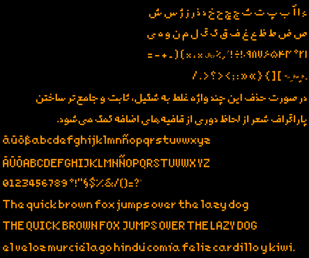
The spacing is something I noticed, too, and I agree with the umlaut thing. The small "e" looks a little awkward - like it doesn't quite know if it's an "a" or "e". You could try making some tweaks to it. You could also see if adding an extra space inside big V and Y would make them more aligned with the rest of the letters.
I'm sorry, this probably sounds like some font snob nitpicking. On a more positive note, I absolutely adore the small "z"! Real solid work for a first experiment.
Yes, small e was one of the most difficult and as you mentioned needs work. Currently, it's a compromise to fit it inside a 4x4 space. I'll reiterate on it and probably post variations later.
I'll experiment with adding space inside U and V. I wanted to reuse V inside W, that's why it's so narrow.
Thanks for the feedback.
PS: and I'm really glad that you liked the lower case z! It was a breakthrough for myself when I came up with the shape on my screen. Didn't work for the capital letter though. (I also tried to avoid making it look similar to WWII SS signs)