this post was submitted on 27 Nov 2024
702 points (98.2% liked)
Microblog Memes
5984 readers
5085 users here now
A place to share screenshots of Microblog posts, whether from Mastodon, tumblr, ~~Twitter~~ X, KBin, Threads or elsewhere.
Created as an evolution of White People Twitter and other tweet-capture subreddits.
Rules:
- Please put at least one word relevant to the post in the post title.
- Be nice.
- No advertising, brand promotion or guerilla marketing.
- Posters are encouraged to link to the toot or tweet etc in the description of posts.
Related communities:
founded 1 year ago
MODERATORS
you are viewing a single comment's thread
view the rest of the comments
view the rest of the comments

What? I don't get how it disproves the graph from the other commenter or anything else
Edit: Oh I thought they were saying the first graph depicts it as worse than it is but it was the other way around which makes much more sense
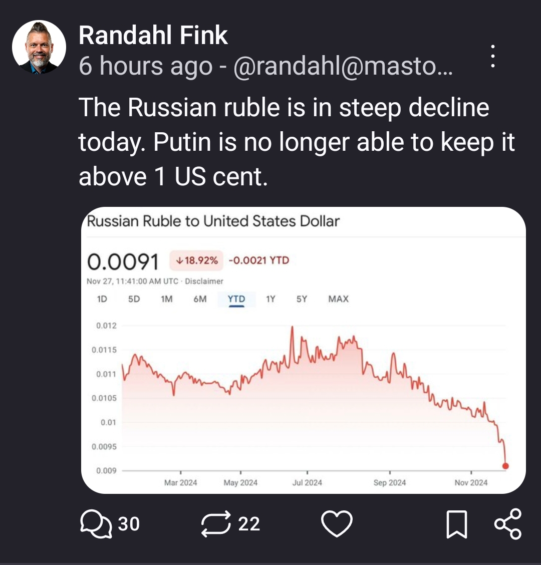
The other commenter cropped their image right before the last massive drop in 2015
By inverting the transaction it more clearly shows the trend between the two currencies.
Maybe if you don't understand basic math? Those charts are just reciprocals
Understanding and visualizing are different things. Perhaps spend some skill points in reading comprehension.