this post was submitted on 27 Oct 2024
52 points (96.4% liked)
Trains
849 readers
1 users here now
Everything about trains and railroads
founded 2 years ago
MODERATORS
you are viewing a single comment's thread
view the rest of the comments
view the rest of the comments

Posted image is literally in grayscale (though the provided link is in color).
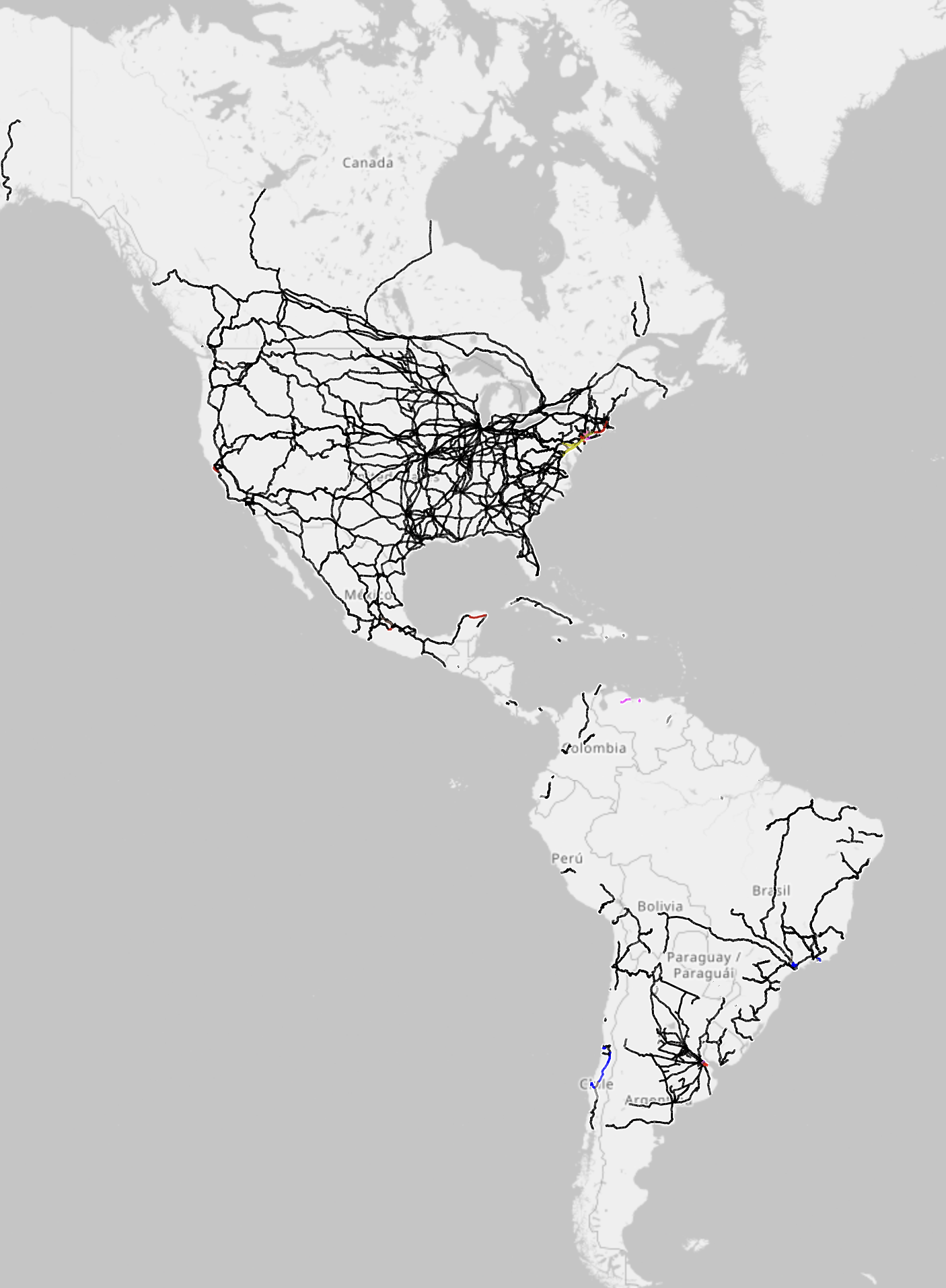
I think the original poster posted this intentionally as sarcasm because there is so little color in the image. If you look at the original image and look at the USA North east near new york, you'll see a few meager lines that are various colors (as well as a few slivers in south and central america, and what looks like a dot in los Angeles). This is showcasing just how little electrified rail exists in the americas.
It may not seem like it, but it is actually in color. I'm on mobile and am able to see it. If you're not able to, it may be an issue with your app or method of viewing the post.
If you check the link they shared, it's practically all orange, so they did not share the default view, nor a color legend to go along with it.
That is correct, it isn't the default view, it's the electrification view, which OP inferred they were using (the title says electrification map). If you open the link, the orange is worldwide general rail infrastructure.
If you click the top right options button (the 3 line "hamburger" icon at the far top right, separate from the map layers), you'll see an option for electrification. This is the map they shared.
The grayscale option actually only grayscales the territory, not the infrastructure. I hope this helps clarify the situation.
I do agree that a legend would have been helpful.