this post was submitted on 02 Oct 2024
243 points (98.8% liked)
NoSafetySmokingFirst
353 readers
16 users here now
Welcome to NoSafetySmokingFirst!
For images where the text reads correctly left to right, but visual cues (like colouration, vertical proximity, or horizontal separation) lead you to try to read it top to bottom.
This is similar to, but distinct from, the more widely known “DontDeadOpenInside” format. In that case, the text reads correctly top to bottom, but visual cues (like colouration, horizontal proximity, or vertical separation) lead you to try to read it left to right.
The post that started it all:
Other related communities:
- [email protected]
- [email protected] (letters arranged in any confusing order)
founded 1 month ago
MODERATORS
you are viewing a single comment's thread
view the rest of the comments
view the rest of the comments
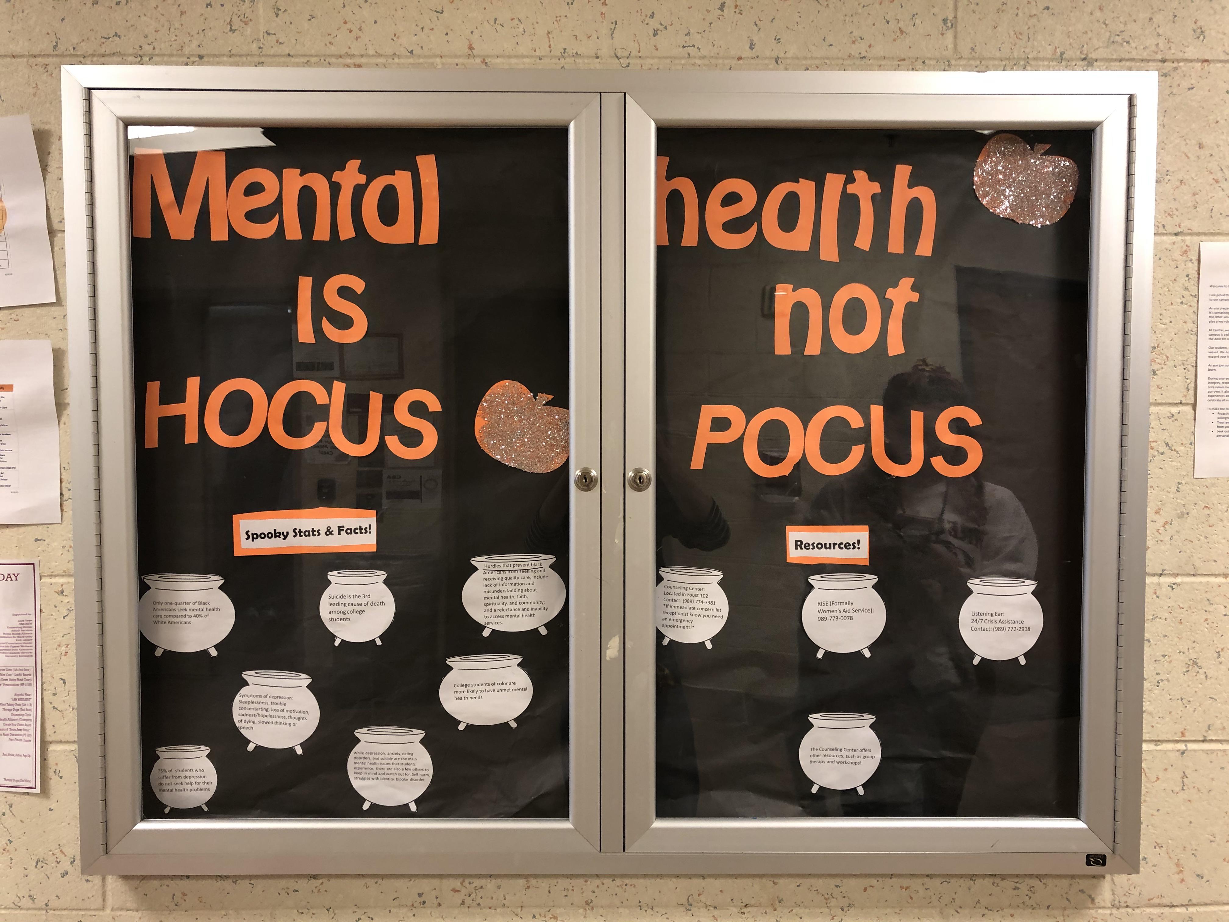
Apart from the 'don't dead open inside' this seems like a nice way to make mental care more accessible to people.
A "NoSafetySmokingFirst" is actually subtly different from a "DontDeadOpenInside".
In a "NoSafetySmokingFirst", the text reads correctly left to right, but visual cues (like colouration, vertical proximity, or horizontal separation) lead you to try to read it top to bottom.
This is similar to, but distinct from, the more widely known "DontDeadOpenInside" format. In that case, the text reads correctly top to bottom, but visual cues (like colouration, horizontal proximity, or vertical separation) lead you to try to read it left to right.
But yes, format aside, it seems like a nice initiative :)
I didn't know about the difference. Thank you for letting me know!