this post was submitted on 30 Sep 2024
297 points (97.1% liked)
linuxmemes
21761 readers
2327 users here now
Hint: :q!
Sister communities:
Community rules (click to expand)
1. Follow the site-wide rules
- Instance-wide TOS: https://legal.lemmy.world/tos/
- Lemmy code of conduct: https://join-lemmy.org/docs/code_of_conduct.html
2. Be civil
- Understand the difference between a joke and an insult.
- Do not harrass or attack members of the community for any reason.
- Leave remarks of "peasantry" to the PCMR community. If you dislike an OS/service/application, attack the thing you dislike, not the individuals who use it. Some people may not have a choice.
- Bigotry will not be tolerated.
- These rules are somewhat loosened when the subject is a public figure. Still, do not attack their person or incite harrassment.
3. Post Linux-related content
- Including Unix and BSD.
- Non-Linux content is acceptable as long as it makes a reference to Linux. For example, the poorly made mockery of
sudoin Windows. - No porn. Even if you watch it on a Linux machine.
4. No recent reposts
- Everybody uses Arch btw, can't quit Vim, <loves/tolerates/hates> systemd, and wants to interject for a moment. You can stop now.
Please report posts and comments that break these rules!
Important: never execute code or follow advice that you don't understand or can't verify, especially here. The word of the day is credibility. This is a meme community -- even the most helpful comments might just be shitposts that can damage your system. Be aware, be smart, don't fork-bomb your computer.
founded 2 years ago
MODERATORS
you are viewing a single comment's thread
view the rest of the comments
view the rest of the comments

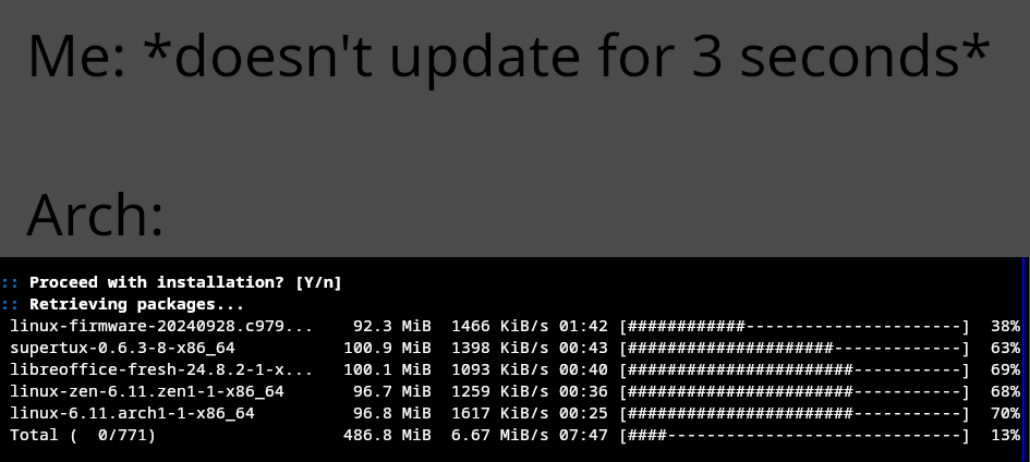
i can barely read the text D:
Does your lemmy app let you zoom images at all? Or is it still too small when you do?
the text on the top of the image has low contrast and i was on a sunny place, so it ws almost unreadable
May i ask which text specifically?
Cause for me everything is easily readable
the black text with gray background. i was in a slightly sunny place and my phone's brightness isnt very good, and together with the low contrast (dark text on dark background) its almost unreadable
Ah sorry 'bout that. I tried to make it darkmode friendly, and white text seemed to bright. Will consider this next time
maybe a light gray would be good but i think a black or very dark gray background with white text is the best option