Hi all,
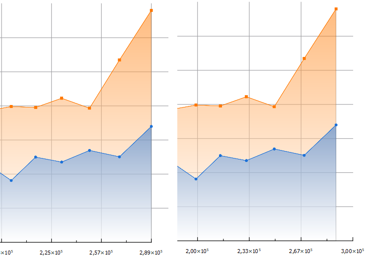
I just started using labplot. Mainly for visualization so far. I am currently plotting stuff in a line plot. For some reason I cannot figure out how to properly align my x-axis. If I reduce the data range my gridlines overextend. If I increase the x-axis range the axis just extends over my data.
Anyone know how to make this fit.
Sorry for the basic question but I have been banging my head against this for 2 days now and just can't figure it out.
If you have some good material beside the videos and documentation I am also happy to just take a link.
Thanks :)
edit: I use LabPlot 2.10.0 on Windows
Hi,
Could you switch to LabPlot 2.11.1? Plot ranges and axis ranges have been synchronized in 2.11 to make any adjustments more intuitive.
You can find it here: https://labplot.kde.org/download
Hi thanks this seems to be the case. The way it was before was pretty confusing for a first time user :D
Yes, the former solution offered more flexibility, but could be less intuitive at first :-)