this post was submitted on 23 May 2024
190 points (97.5% liked)
British Columbia
1359 readers
21 users here now
News, highlights and more relating to this great province!
founded 3 years ago
MODERATORS
you are viewing a single comment's thread
view the rest of the comments
view the rest of the comments

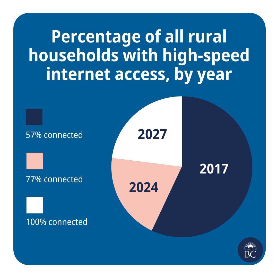
Took me a minute, but it actually isn't that bad. The size of the last two sections represent the additional % on top of the previous...
Having said that, there must've been a better, less confusing way to represent this data
I've always said bar or line, especially with time axis. In cases like this, you usually use a line as it usually isn't linear growth anyway and you'd use a logarithm to predict where it'd be in 2027.
Of course they're just bullshitting that 100% as real predictions wouldn't ever get there.
yep line plot for sure.
The years aren't equally spaced in time, and the future forecast should be clearly differentiated - maybe with a dotted line, or a high to low spread.
The graph hides how ambitious it is to more than double the rollout rate.
We should expect to see cost per year (or workforce or some measure of resources) aso more than doubling.
Presumably this is a funded a plan, not strictly a forecast, so it's not unresonable to have accelerating growth, if more resources are going in.
If resources are constant, then yes I'd think diminishing returns wold shape the forecast.
You could easily improve it significantly by labeling the segments:
I think the way to go would be to give each slice a different radius, so you could see that they're layered over one another.