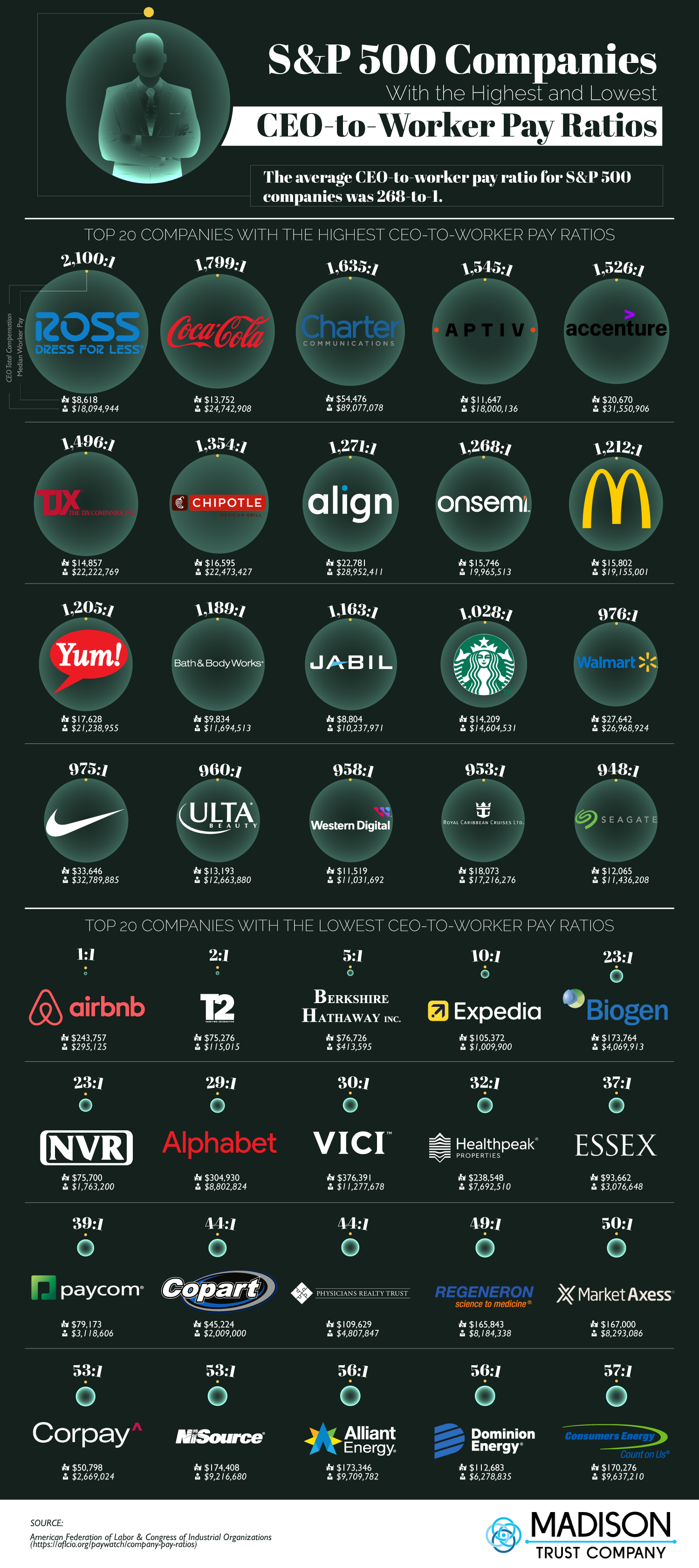
Is the red alphabet logo as in Google's parent company? I don't remember that logo being red...
this post was submitted on 07 Dec 2024
434 points (96.2% liked)
Data is Beautiful
1583 readers
18 users here now
Be respectful
founded 8 months ago
MODERATORS
More reasons to boycott Coca Cola, McDonald’s, Walmart, Nick and Starbucks.
Super interesting and nice chart. I wonder if it is a bit misleading to include part-time employees at some of these retail locations. Maybe it should only compare full-time. I know there are a lot of employees at say Walmart who are capped at 30 hours a week so they don’t have to pay them benefits and highlighting that is important too. But if it includes employees that work 10 hours a week it might be inflating the ratios and that might be why so many retailers are at the top of the list.
