this post was submitted on 02 Dec 2024
185 points (94.7% liked)
Fediverse
28731 readers
228 users here now
A community to talk about the Fediverse and all it's related services using ActivityPub (Mastodon, Lemmy, KBin, etc).
If you wanted to get help with moderating your own community then head over to [email protected]!
Rules
- Posts must be on topic.
- Be respectful of others.
- Cite the sources used for graphs and other statistics.
- Follow the general Lemmy.world rules.
Learn more at these websites: Join The Fediverse Wiki, Fediverse.info, Wikipedia Page, The Federation Info (Stats), FediDB (Stats), Sub Rehab (Reddit Migration), Search Lemmy
founded 2 years ago
MODERATORS
you are viewing a single comment's thread
view the rest of the comments
view the rest of the comments

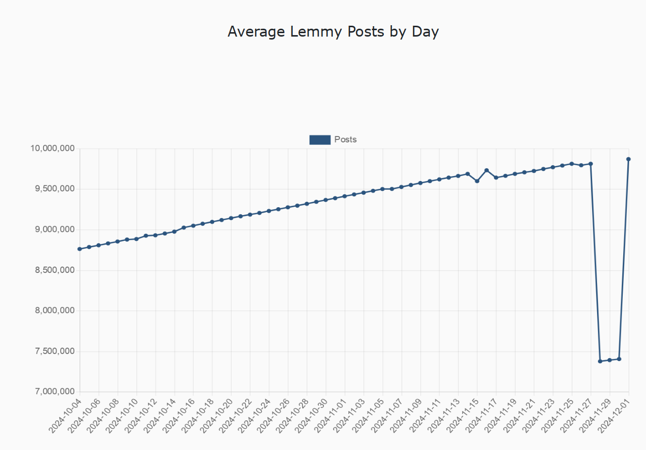
I hate the fact that the vertical axis starts at 7 million, making the drop seem deceptively large
Seems fine to me, the axes are easy to understand and there would be a lot of unnecessary whitespace otherwise. Though, it does require some reading comprehension, and that one actually looks at it and not just skims over.
I agree that this way of displaying the data is appropriate, but it would be nice to have a very visible indicator of this. Some kind of highlighted "fold" line or something at the very bottom of the chart, maybe. If I can deduce the units from context, and the trend is more interesting than absolute numbers, then I'm not going to look at the axes most of the time