this post was submitted on 15 Jul 2023
21 points (100.0% liked)
Tabletop Painting
151 readers
1 users here now
A community dedicated to painting tabletop miniatures, terrain, and so on. All skill levels welcome!
founded 1 year ago
MODERATORS
you are viewing a single comment's thread
view the rest of the comments
view the rest of the comments

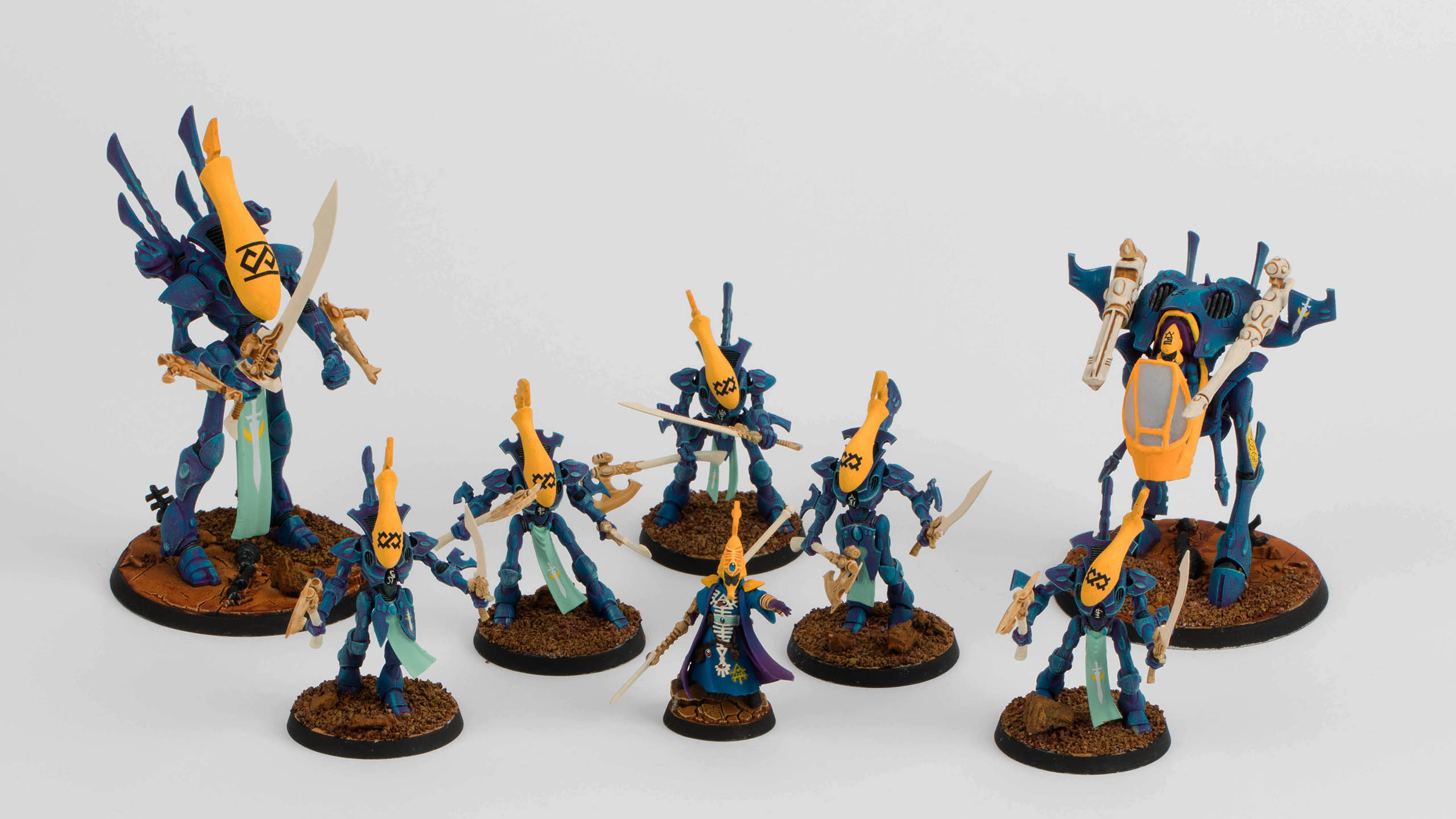
They look great, if you are after some C&C the yellow looks a little flat and could use some shading.
Thanks mate. Yellow is such a hard colour to paint. If you zoom at the farseer helmet you can see I did some shading but overall the huge flat yellow helmets were so difficult that I just gave up. At least I now know not to paint large yellow panels in future.
Yeah I get it, yellow is a bitch