26
Vexillology
35 readers
2 users here now
A community all about flags! Feel free to post flags you like (or dislike), flag designs of your own, flag-related news, or anything else of the sort. ### Rules **Be civil.** As per kbin.social's terms of service, be respectful to others. Harassment, racism, homophobia, etc. will not be tolerated. **Don't plagiarize.** If you post someone else's flag design, make sure to clearly credit the original creator so that it doesn't appear to be your own. This obviously doesn't include established flags (i.e., you don't need to worry about crediting the designer of the U.S. flag). **Stay on topic.** Please only post about flags. You can post flag designs, flag collections, flag news, flag discussions, or whatever else, but it needs to be at least somewhat related to flags.
founded 1 year ago
27


32
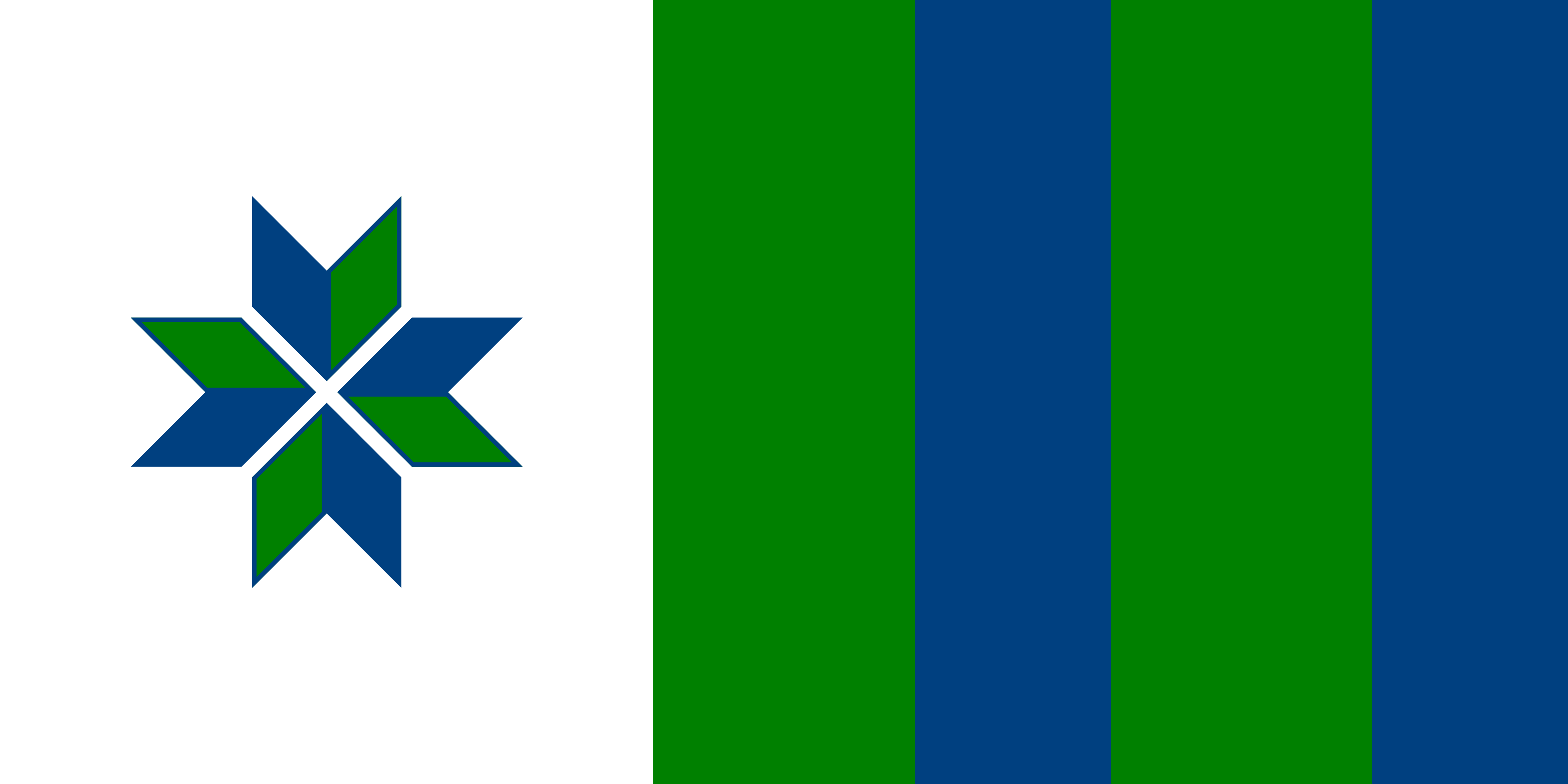
This is my City of North Battleford, Saskatchewan, Canada redesign. Not too much in-depth thought about it. But, thinking is the blue are the Battle River and North Saskatchewan River, green the land and white for our winters. Plus, thinking rotate it with the white side on top, it would make a nice pattern 🤷♂️😄


38


44
3
Harford County - Maryland - United States.
https://en.wikipedia.org/wiki/Harford_County,_Maryland <https://en.wikipedia.org/wiki/Harford_County,_Maryland>
(media.kbin.social)


46
I figured this was fitting since C is the Roman numeral for 100.

47
2
A lot of Pride flags in Oslo right now, including my first time seeing Vecchietti's Progress flag in real life! Feat. seven-stripe lesbian flag
(media.kbin.social)

48
1
Norwegian and Ukrainian wimpels fly next to the municipal flag outside Lillestrøm city hall.
(media.kbin.social)


50