126

A community dedicated to flags and discussion about flags.
Other communities:
For comparison, this is the standard version that you see plenty of nowadays:

A few different versions with different shades of blue and yellow circulate. I have not really managed to pinpoint which versions where used where and when. Any opinions on which color combination works best?


It is a bit curious that Russia also darkened the blue on their flags and changed the proportions to 2:3 after independence. As far as I know, it's just a coincidence.
The flag matches a typical Ukranian wheat field, leading to some of the nicest "photorealistic" flags:

Although this is nice symbolism, it's likely not the origin of the flag. Already in 1410 Lwów/Lviv used a blue-yellow banner, which could be the origin of the colors:


The characteristic black-white gyronny is taken from the flag of Lisbon, but with the coat of arms of Ceuta in the middle (looking almost identical to that of Portugal). The addition of this coat of arms almost makes this Spanish city flag more Portuguese than the flags of Portuguese cities.
The flag of Lisbon looks like this:
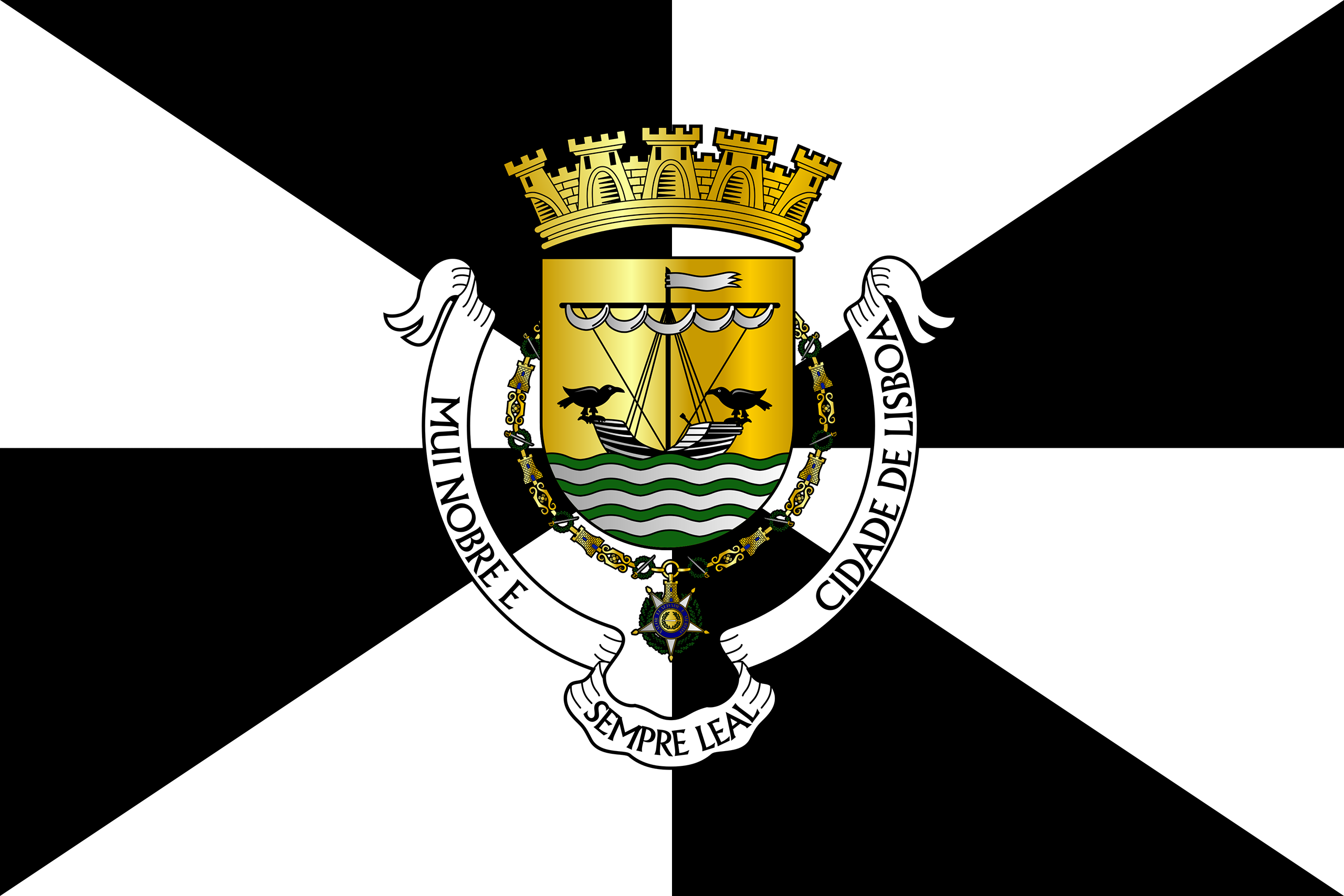
Gyronnies are a typical feature of Portuguese vexillology, with many city flags featuring it. You can scroll through this list of Portuguese municipal flags to see plenty of examples: https://en.wikipedia.org/wiki/List_of_Portuguese_municipal_flags

Wikipedia article about the flags of Napoleonic Italy
The Napoleonic Republic of Italy encompassed only a small part of northern Italy, as shown on this map:

Nonetheless, the flag lives on today in the presidential standard of Italy:

The colors are of course unequivocally Italian. However, the choice of colors to represent Italy, first occurred with the Napoleonic invasion. Before that, there was no unifying Italian symbol, as Italy was fragmented in state. The exact origin of the color choice is unclear.
The lozenge (the diamond) is a peculiar feature of the flag. It occurs rarely, the most prominent example of course being the flag of Brazil. A similar flag was used by the Second Republic of Venezuela 1813-1814.
The lozenge seems to be a feature of French military flags, that came in vogue at the time. See this discussion on the question: https://history.stackexchange.com/questions/35824/how-can-a-diamond-shape-be-a-reference-to-napoleon

Source: https://flagsforgood.com/blogs/news/transgender-flag-day
The design has some competitors, like this neon green flag used in Israel:

And this version in use in Ottawa:

One of the strangest flags I’ve ever seen it didn’t last very long
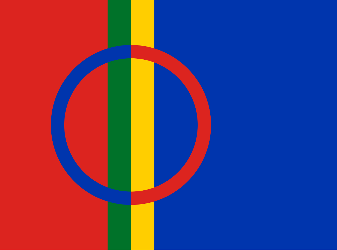
The circle in the middle symbolizes the sun ad the moon (that's why it is divided in two). The colors are those used in traditional Sámi clothing. Here's an example of how the clothes could look:

This is a series I used to do over on Reddit I may continue it on here
Taken from here: https://www.deviantart.com/silas-coldwine/art/Tri-State-568249219
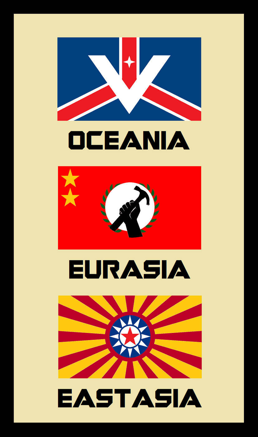
I don't think they are based on any descriptions in the book. They are likely just artistic conceptions that fit the states in 1984.
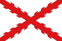
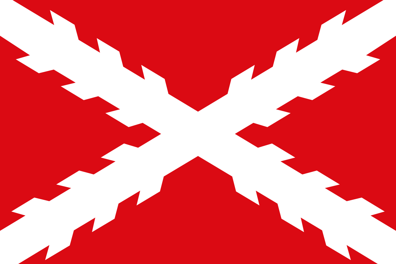
The original Spanish flag used like this:
In the next, more successful revolution in Ecuador, starting in Guayaquil, two other flags were used before joining Gran Colombia and getting a yellow-blue-red triband similar two what is in use today:


Version of these flag would also appear 1845-1860:


The current flag looks like this, which obviously needs changing:
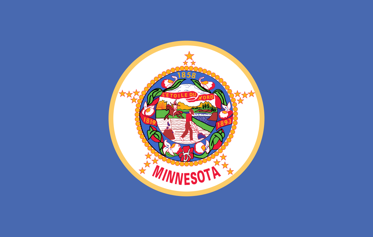
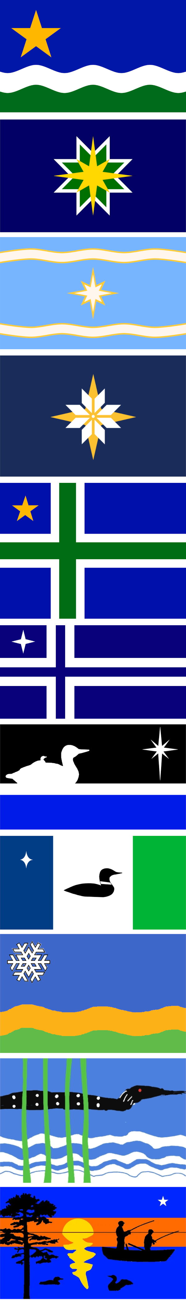
There is a commission tasked with proposing a new design. A news article about it is available here: https://www.cbsnews.com/minnesota/news/minnesota-house-bill-moves-forward-commission-to-redesign-state-flag-and-seal/
The top proposal, called "The North Star Flag", seems to be a popular favorite.
I gathered these proposals from these two sites: https://newmnflag.org/designs https://vexillology.fandom.com/wiki/Minnesota
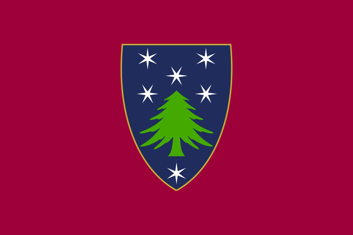
I love the colors and design of this flag despite being a shield-on-a-bedsheet. Massachusetts' official colors are blue, green, and cranberry.
This is not my design, this was created by /u/interrobang26 from this post: https://old.reddit.com/r/vexillology/comments/jvwq1y/massachusetts_cranberry_and_pine/
I probably vote on the top alternative
It was probably for the better that they did not go for this flag. It is hard to think anything else than "Russia with a crocodile". And at least I relate that to the dangerous semi-synthetic opioid desomorphine, common in Russia, and referred to as "krokodil".
Here's another proposal used different colors, which I think would have worked better:

More proposals here: https://www.nlj.gov.jm/Ja50/Public%20Suggestions%20for%20the%20Flag.htm

Coat of arms in question:

Of course, the current flag is great, but a feeling lingers that it was a missed chance to get pineapples on a national flag.
I think the middle pineapple should also be golden, though. Not really sure what happened there.
More proposals here: https://www.nlj.gov.jm/Ja50/Public%20Suggestions%20for%20the%20Flag.htm

This was an initial proposal, with the same colors in a slightly boring horizontal triband:
Another proposal rearranged it a bit, but was discarded as too similar to the flag of Tanganyika, which seems quite reasonable, since they did not know that problem would be short-lived:

In the end they went for the saltire, which seems like a great choice, creating a more unique and interesting design.

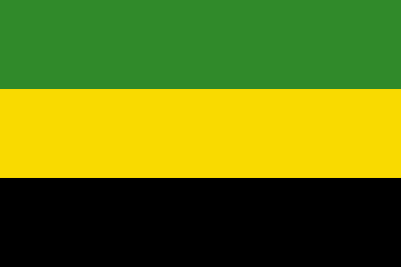
The previous flag was alongside Jamaica, the only national flag in the world without either blue, red or white.
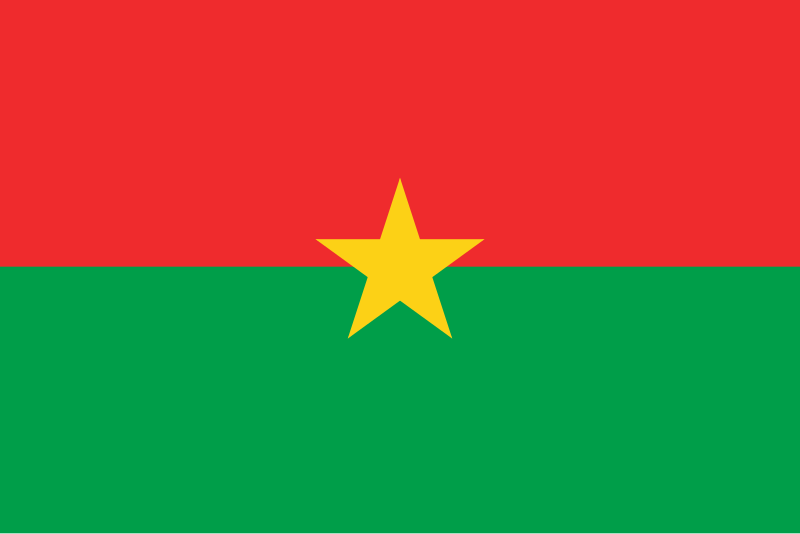
The change happened after a coup, headed by the legendary Marxist and pan-Africanist Thomas Sankara. These ideologies are also reflected in the flag, with a Marxist-inspired design and the pan-African color palette. This makes the flag not a nice example of a simple yet beautiful design, but also a good example of how vexillology can be used to express an ideological stance.
The flag of Upper Volta had a quite different feeling, rather leading the thoughts to, well, the German Empire, which incidentally had an identical flag:


