76
7 stripes for 7 core founding fathers
13 stars in a circle for the original 13 colonies
1 larger, more prominent star in the center of the 13 for E Pluribus Unum
3:5 for both flag and blue corner

A community dedicated to flags and discussion about flags.
Other communities:
7 stripes for 7 core founding fathers
13 stars in a circle for the original 13 colonies
1 larger, more prominent star in the center of the 13 for E Pluribus Unum
3:5 for both flag and blue corner
In my opinion a triangle generally looks better, but the trapezoid flags definitely gets points for distinctness, which shouldn't be underestimated.
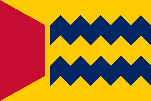
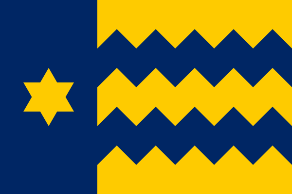
Made a flag for a fictional country, Vefkovîî. How is it?
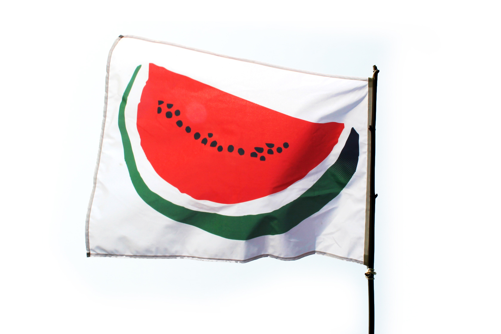
Explanation: How the watermelon 🍉 became a symbol of Palestinian protest 🇵🇸
It's especially relevant now, because Meta (i.e. Instagram and Facebook) is hiding posts and comments containing the Palestinian flag emoji, and people are turning to using the watermelon emoji as a substitute.
As an aside, the Jordanian flag emoji 🇯🇴 and the Western Saharan flag emoji 🇪🇭 are visually similar enough to the Palestinian flag emoji to be good substitutes.
The AK-47 and hoe of the Mozambican flag can also be seen as a version of the hammer and sickle, else the symbol is no longer used on national flags today.
The Angolan flag is derived from the flag of the ruling party MPLA, which led Angola to independence from Portugal:

Since MPLA won the Angolan Civil War, this flag has remained, although there have been plans to change the flag to something less politically loaded. This is a proposal:

If the winner of the civil war would have been UNITA or FNLA instead, maybe the Angolan flag would like one of their flags.
Flag of UNITA:

Flag of FNLA, which looks quite nice IMO:


Symbolism mainly taken from the coat of arms:

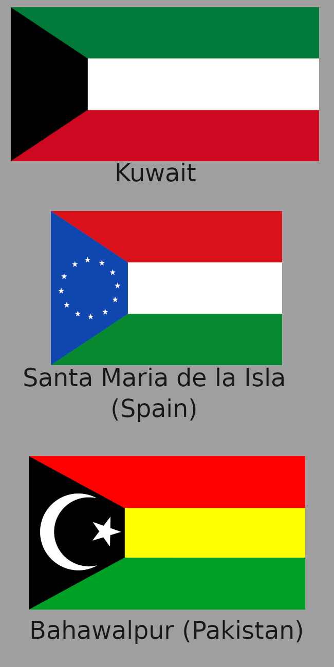
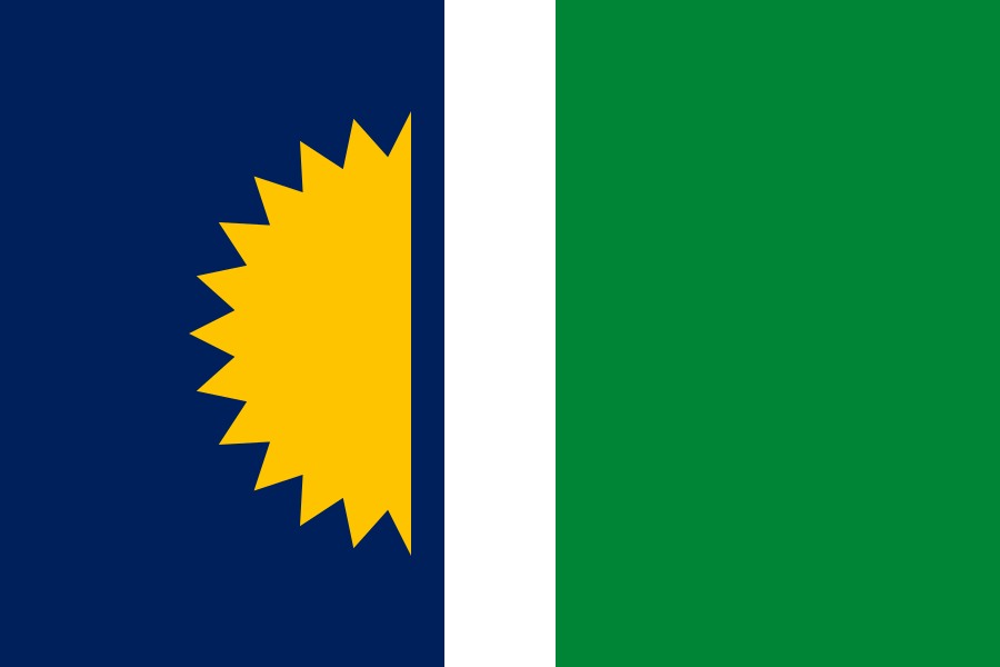
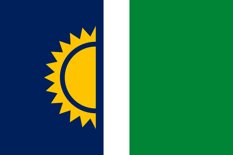
Some other redesigns:
From HansLN
From Reddit user u/imagiflaggi:
From Reddit user u/DerCriado:
From Reddit user u/Eunaotenhoesmola:

(Since you almost need a magnifying glass to see the small purple fields in the rainbows of the flags of El Salvador and Nicaragua, I think they barely count.)
The original flag from 1978 had the sisserou parrot looking the other direction, and a different color order in the cross:

The current flag dates from 1990 (apparently also adopted November 3).


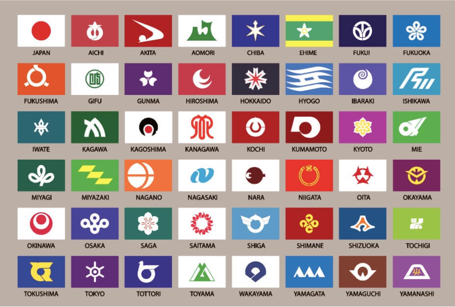
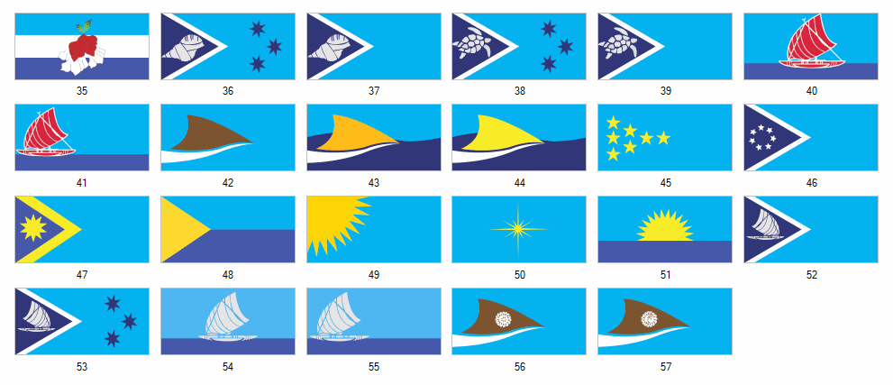
Here's an image with the flags and the prefecture names:

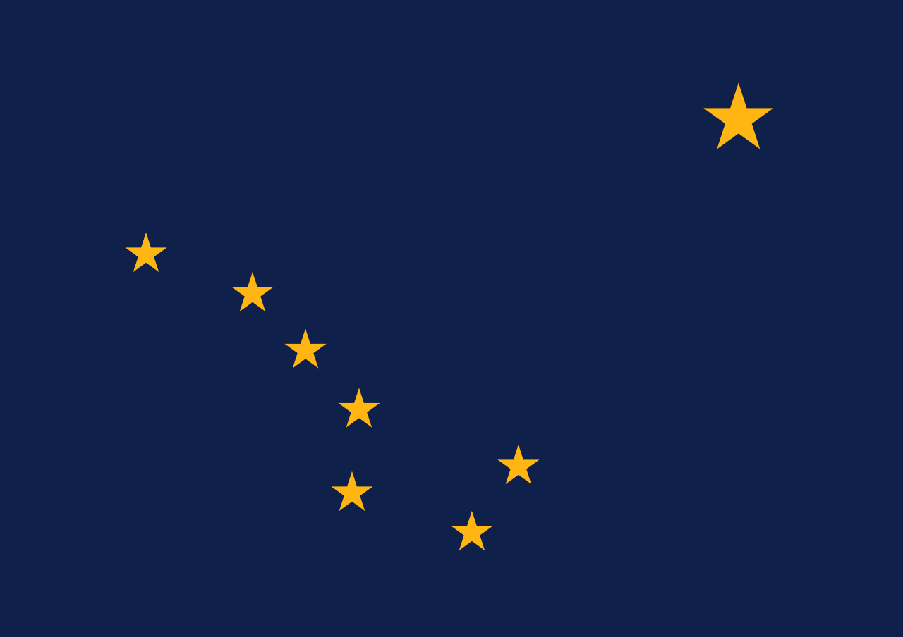
The large star in the middle represents the island of Niue, the four smaller stars represent the Southern Cross.

Alternative colors:
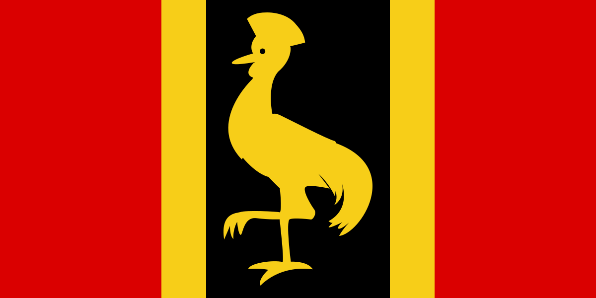
It is based on the provisional flag of Uganda, used on the eve of independence in 1962:

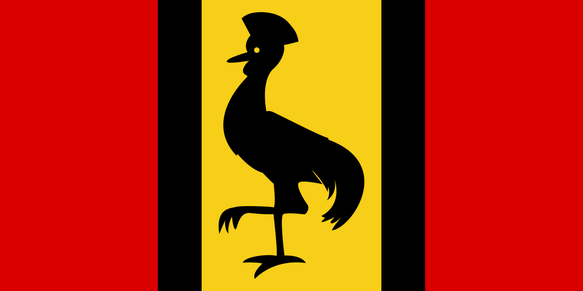
I liked how the crane was more prominent, and not just an indistinguishable spot in the middle. However, I still preferred the colors of the current Ugandan flag.

The solution seemed easy enough: combining the two!
This is a quite obscure flag that little is known about. I can't even say that it is rotated the correct way and shouldn't be lying down instead. However, I couldn't help but opt for the funnier rotation.
The flag was possibly not in widespread use, or only used briefly. The more commonly cited flag of the Buchara Emirate looks like this:
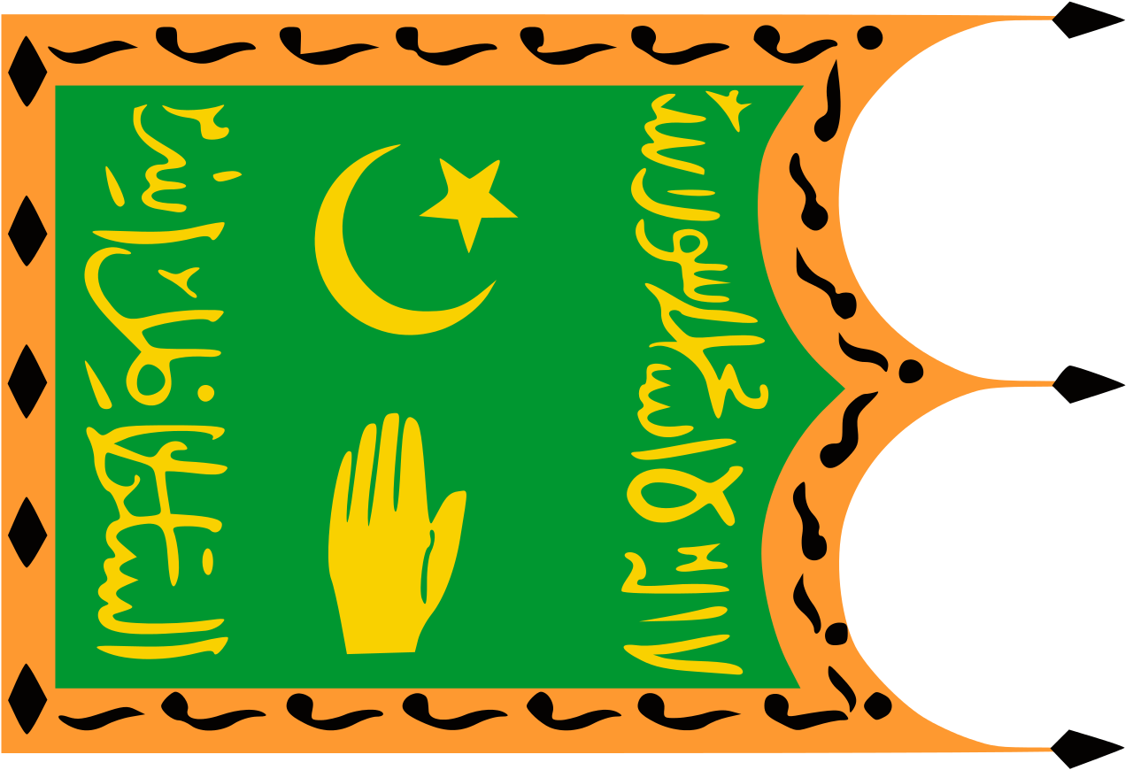
The only source seems to be that some guy named Ivan Sache's parents saw this flag in a museum Buchara. There was no caption, so it's uncertain how this flag was used, or even how it should be rotated. There is a low-quality picture showing it displayed horizontally:
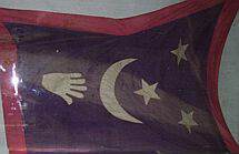
However, it does not seem implausible that the hand of Fatima would point upwards, as it normally does. If there is no red border at the bottom, which cannot be seen, it would seem logical that that would be the hoist side. And not the least, it would definitely be more amusing if the flag was rotated this way.

There does not seem to be an officially defined shade of blue, but a bright blue is seen in for example these pictures of prime ministers:

Many do believe that it should be dark blue though, as shown by a quick ducking. On Wikipedia, there seems to be an ongoing edit war about it.
Then there is the color of the feathers, that allegedly where changed from blue to grey in 2011, but sources are not 100% reliable.


