Logo Edits - logos edited to say / read something else

73 readers
1 users here now

Introduction

This community aims to be a continuation / adoption of the logo-editing "Sbubby" tradition of Reddit.

You can submit edits of a logo that does not resemble a patchy hack job of mish-mashing letters together.

Rules for guidance:

founded 1 year ago
MODERATORS
1
3
submitted 1 year ago* (last edited 1 year ago) by NoisyOne57 to c/logoedits


Getting the Right Idea: The Art of the Eef Freef and the Eeble Freeble

Logos are ubiquitous In the modern world. Everywhere you look, there are signs, symbols, words, and figures that we associate with products, services, businesses, and causes. Famous logos, like those of Nike or Coca-Cola, are instantly recognizable to billions of people.

Moreover, logos don't just identify, they communicate. They reflect beliefs, personalities, and visions. Studies have shown that people can form genuine psychological attachments to brands and the values they claim to represent.

A Logo Edit, at its core, is about taking a logo and making it communicate something different. Often times, this means taking all that identity and meaning and transforming it into something silly or nonsensical.

The best Logo Edit projects are those that remain instantly recognizable while being utterly absurd, sending the viewer slipping into the uncanny valley.

The focus of this tutorial is on how to come up with in-spirit Logo Edit projects with that refreshing, surreal flavor.

it's impossible to precisely explain what makes a good in-spirit Logo Edit, it's like jazz in that if you have to ask, you'll never know.

That being said, Logo Editors have succeeded in characterizing two general categories of in-spirit contributions:

  • Eef Freef Logo Edit projects focus on taking a brand's text (wordmarks, slogans, etc.) and rephrasing them into nonsense
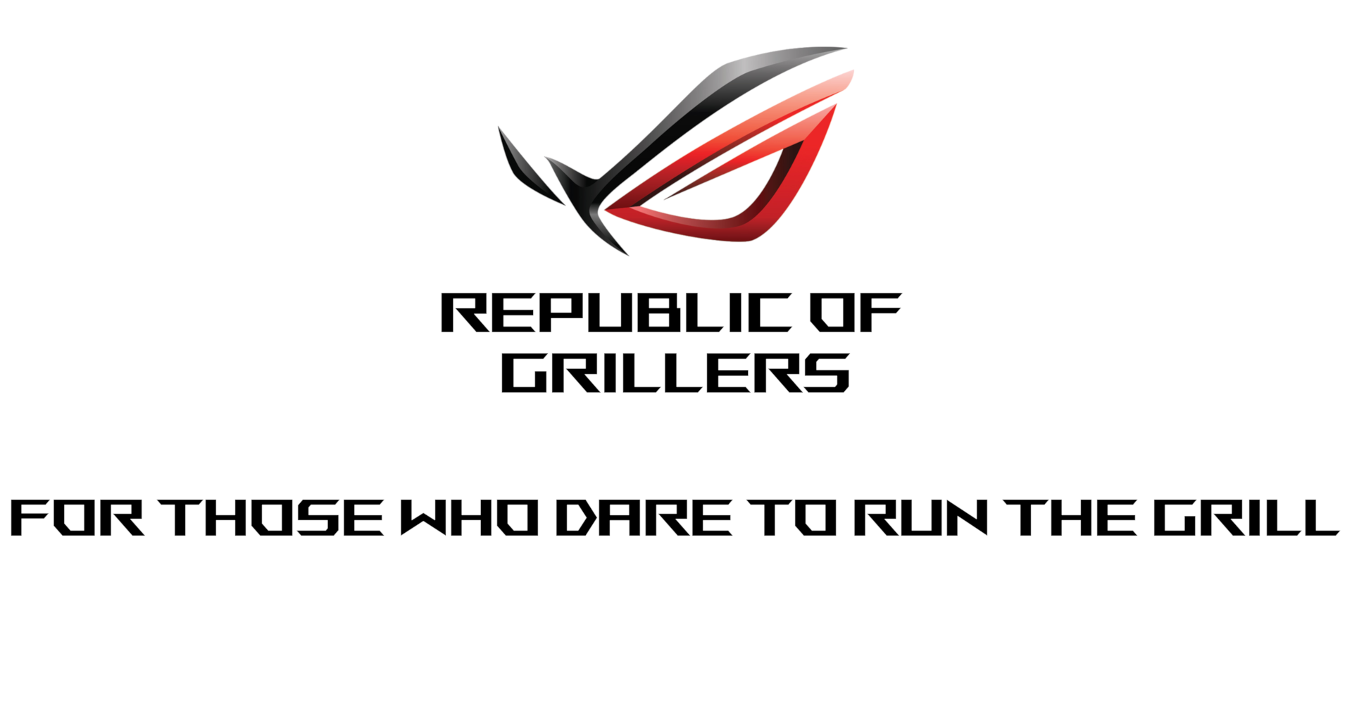
  • Eeble Freeble Logo Edit projects focus on taking a brand's graphic design and representation (shapes, characters, etc.) and twisting them into ridiculousness. Note that these are not mutually exclusive genres -- a Logo Edit may feature elements of both. However, in this guide we'll focus on each separately as they tend to work towards different goals.

Eef Freefs

Companies spend enormous amounts of time meticulously crafting wordmarks, taglines and slogans: To resonate with their intended audience. Every phrase, word, and letter is carefully selected and focus-grouped to make the best possible impression. Meanwhile, a good Eef Freef is like a proverbial elephant in a china shop. These Logo Edit projects come in many varieties, but all tend to inspire reactions like these:

  • "Reading it makes it feel like you're having a stroke"
  • “Its like when a Pentecostal Christian speaks the gift of tongues”
  • "I thought I forgot how to English and then I realized what sub this is”
  • “I have no idea why this is making me laugh so hard I can't breathe, but that doesn't stop it from happening”

Eef Freefs take the language incorporated Into logos and spins them into a meaningless slurry of sounds or a crazed flight of ideas. However, you can’t just smash your keyboard and call it a day.

There's a certain uncanny valley in which Eef Freef tends to work best.

In general, there should be enough of a connection to the original wording such that it’s still recognizable as a corruption of the original, but twisted enough such that it’s total nonsense.

Even when an Eef Freef changes logo text to something entirely different, there's usually some structure to it.

Here are some examples of common styles of Eef Freef along with the examples (no images yet):

  • Classic: The text superficially follows the form and cadence of the original but turns out to be complete nonsense upon closer inspection:

Red Lobster - Roob Loob, Duolingo - Dungomungo, Chromebook - Cronkbomk

  • Repetition: The text gets stuck on a particular word, phrase, or letter and trails off:

Sega - Assssssssss, Fortnite - FORTNAAAAA, Yamaha - Yamahammahayaayamama

  • Clanging: The text turns into a chain of rhyming, alliteration, or other sound associations:

Ratatouille – Ratatatatatata, Johnson and Johnson - Johnson and Ohnson and Hnson and Nson and Son and On and N

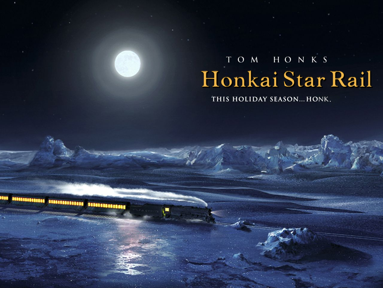
  • Replacement : A memorable wordmark or slogan gets substituted with something entirely different:

Hitman 2 - Swause 2, Kodak - Flarble, Subway - Midladmirg

Eeble Freeble Eeble Freeble The majestic Eeble Freebles are the graphic design counterparts to Eef Freefs: dismantling and rearranging the visual elements of logos to make something wholly new and/or strange. Again, there's no strict definition here, but common reactions include:

  • "it's like a biblically accurate angel”

  • “Okay, who unraveled all the logos again?”

  • "Legends say the logo goes on forever”

  • “This has surpassed being a meme and ascended into modern art” As a guide for inspiration, there following are examples of Eeble Freebles:

  • The Maze: Logos are pulled apart,resembling winding and forking paths.

Subway - A subway to... somewhere?, Sega - Racetrack loop, Google Tool Suite - All over the place

  • Pattern Continuation: Extends a pattern or motif in original logo to the point of absurdity

Adidas - An endless staircase, Subway - Knitted pattern, Burger King - Burger Kibble

  • Allusion: Used to create a mash-up that stylistically references some famous artwork.

Playstation - M.C. Escher, Coca-Cola - Hokusai

2
5
submitted 1 year ago* (last edited 1 year ago) by NoisyOne57 to c/logoedits


The Guide to Logo Editing

Welcome to the Guide to Logo Editing! This guide is intended to be a resource for helping people make quality logo edits for Logo Edits. it aims to provide those new to image editing with some basics to get started with making their own Logo Edit projects, and to help experienced Logo Edit makers refine their craft with more advanced tips and tricks.

This guide is not set in stone, and is open to contributions! Everyone has their own way of doing: things, and if you know of any useful techniques that aren't detailed in this guide, write something up and either make a comment below, or contact the moderators, and we can see about adding it in!

The Guide

Choosing an image editor

The first step in making a Logo Edit is choosing an editing tool. There are several popular options for image editors that are capable of making Logo Edit projects. If you aren't already familiar with an editor you prefer, you may want to try out a few different options and see what works best.

Good editors:

Any of the following editors should be powerful enough for most, if not all, Logo Editing needs.

  • Photoshop: it's quite expensive, but If you already have access to it, Photoshop's reputation speaks for itself. Certainly not worth purchasing just for the sake of hobbyist image editing, though.

  • GIMP: Short for GNU Image Manipulation Program, GIMP is free, open-source, available on Windows, Mac, and Linux, and quite powerful once you learn its ins and outs. One of the most popular free image editors, and the preferred editor of the writer of this section.

  • Krita and Paint .NET (https://www.getpaint.net/) are two additional tree editors commonly used for Logo Editing, which have similar capabilities to GIMP. Krita is available on all major desktop operating systems, though Paint .NET (https://www.getpaint.net/) is Windows-only.

  • Paint 3D is another alternative, made by Microsoft as a more powerful and fully-featured version of MS Paint. Free, but Windows-only.

  • Photopea is a free browser-based image editor that functions similarly to Photoshop, which can be useful on Chromebooks or in other situations where downloading a full editor isn't feasible, or when a UI that closely resembles Photoshop is desired.

Editors to avoid unless you really Know what you're doing:

  • MS Paint: While it's universally available to every computer that runs Windows, Paint simply lacks the capabilities of other more powerful editors. it’s possible to create very simple Logo Edit projects with Paint (usually involving letter rearrangement), but its limitations mean that it’s usually best off avoided. MS Paint on Windows 11 has a few more features than Paint on previous versions of Windows, so it may be slightly more suitable, but still avoided if possible.
  • Mobile editing tools: The lack of precision of a touchscreen interface compared to a mouse and the lack of keyboard shortcuts make image editing on mobile devices far more difficult. That said, there are a few regular contributors on Logo Edits that contribute high-quality edits from mobile devices, so it is possible. If you don't have the option to use a desktop editor, there are a few editor options.

If you're on iOS/Android, ibisPaint can be considered as the best Photoshop alternative for mobile, with its features that is most usable for artists and photo editing enthusiasts alike (layering options, clipping mask, photo manipulation feature set, etc.) it also enables you to do pixel-level modifications (something that is mentioned in "Basic Editing Tips" below) that will greatly improve your Logo Edit projects.

Other viable mobile editors: Autodesk Sketchbook (Android/iOS), Photo Editor (Android), Vectornator (iPad, desktop), Procreate (iPad, desktop)

Vector editors:

vector graphics (typically saved in the .svg format) save image data as a set of points, lines, and shapes, as opposed to the pixel-by-pixel data stored by typical “raster” formats (.png, jpg, .bmp, etc). While vector formats aren't suited for storing highly complex images such as photographs, they are excellent at working with images with clearly-defined lines and shapes, which is well-suited for logos. Most professional logo design is done with vector image editors. Vector editors have the potential to be extremely powerful Logo Editing tools, though the different skill-set required and greater difficulty in tracking down source images (raster images cannot be modified by vector programs) make it quite rare.

  • The two most common vector image editors available are Adobe Illustrator (like most Adobe products, not worth buying for hobbyists) and Inkscape, which is free.

Before You Begin

What to do before even opening your image editor.

  • Know your tools! This comes with time and practice, but it never hurts to explore your image editor and try out some of its more specialized functions and understand how they can be used to your advantage. Try to learn the keyboard shortcuts of functions you use frequently!

  • Getting the right idea: If you want your Logo Edit to get noticed, you'll need a good idea of what you want to make! Try to come up with something unexpected.

  • Finding quality source images: Ensure your base image is large enough and in high-resolution - otherwise your effort is doomed from the start!

  • Fonts: Many major logos (esp. those with simple lettering styles) have a specified font that can often be found online. Companies themselves often have public branding guides available, providing detailed instructions on how their logos are rendered, often including the fonts used, their exact style and sizing, and precise hex/rgb codes for the colors used. Locating the font used and downloading it can make your efforts significantly easier, though it's not required.

  • Use font identification services/browse font ID forums. If you are unsure of what font to use for or want to use the exact font used in the logo(s)/packaging you are editing, consider using font ID services (like myfont's WhatTheFont, or whatfontis.com’s Font Finder). Softonium Development's Find my Font delivers the most accurate identifications most of the time. If you are still unsure of what to use or your font ID service does not give you an accurate result, perhaps font ID forums are your best resource, with one viable opinion being the dafont.com Font Identification Forums.

  • In some cases, you can use a logo generator site like FontMeme, Fontbolt, and even the font preview function of dafont.com to create your edits.

  • Have patience! More complex edits can take quite a while, especially with less editing experience, so pick your project wisely and don't rush things!

Basic Editing Tips

Editing basics that should apply to most/all image editors

  • Learn the selection tools of your editor and make sure you select only what you need to when moving things around,

  • Basic letter rearrangement: One of the simplest techniques, and can be very effective, though you need to be careful about spacing and alignment.

  • Use grid lines to ensure everything stays aligned and spaced! Counting the squares In the gray and white "checkerboard" background of transparent images is also useful for measuring distances.

  • Using transparency: Works well for colorful logos, but very dark or very light logos can blend into the background depending on a user's color theme (dark mode/light mode).

  • Don’t be afraid to do pixel-level corrections! it takes time, but helps clean things up.

  • Periodically zoom out and check how things look from a big-picture view. sometimes you'll see problems that weren't noticeable at a smaller scale, and sometimes you'll find that imperfections which are glaring on the small-scale are almost unnoticeable at a normal zoom level.

  • Use the color dropper tool to color-match. Small differences in color can be very noticeable on the final product, so you'll want to make sure your colors match exactly with the original logo.

Advanced Techniques

  • Splicing letters together: If you can't find a font for a logo, it's still possible to create new letters by cutting up and/or splicing together other letters. However, be very careful when doing so - watch for edges, blend as best as you can, don't overreach if the shapes aren't there.

  • Working with gradients: Many logos use gradients in their background, and shifting any of their text will cause noticeable gaps. Luckily, the gradient tool in many editors can help patch those over!

  • Style-matching fonts: Even if you find the right font of a logo online, you'll want to make sure that it's being rendered in the right style so it actually looks like the logo text! The font size, color, styling (bolding, italics, etc.), gradient, and texture all matter! As mentioned previously, many corporations have branding style guidelines that can help with this.

  • AI up-scaling services: it it happens that you are not able to acquire high quality images/sources, you can consider using AI upscaling services/software with your sample on hand. Nero AI's Image Upscaler and Vertexshare's AI Enlarger are both viable options.

3
1
Limbus Company (lemmy.world)
submitted 1 year ago by NoisyOne57 to c/logoedits


A logo edit of the Budmil clothing company, which makes use of the Futura font

4
-2
Musk Bank (lemmy.world)
submitted 1 year ago by NoisyOne57 to c/logoedits


This is a logo edit of the Deutsche Bank's logo edited with the new X/Twitter logo

5
5
submitted 1 year ago by NoisyOne57 to c/logoedits


A logo edit of the Asus ROG logo, made in conjunction with the other one.

6
5
Sussy Asus (lemmy.world)
submitted 1 year ago by NoisyOne57 to c/logoedits


Logo edit of the Asus logo, reflecting on their AM5 fiasco and how did they handle it

7
4
Ultrantel (lemmy.world)
submitted 1 year ago by NoisyOne57 to c/logoedits


Logo edit of the Intel logo, based on the fact that they're sunsetting the "i" branding of the Core processors and replacing the "i" with "Ultra" in some cases

8
4
Honkai Star Rail (lemmy.world)
submitted 1 year ago by NoisyOne57 to c/logoedits


Logoswap with Polar Express

9
3
Hoagie Duke (lemmy.world)
submitted 1 year ago by NoisyOne57 to c/logoedits


Logo edit of the 2016 Subway logo

10
6
Sandwich Peasant (lemmy.world)
submitted 1 year ago by NoisyOne57 to c/logoedits


Edit of the Burger King / Hungry Jack's logo.