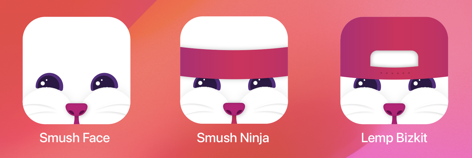
Really like the bottom right smushed face for some reason
Memmy - An iOS client for Lemmy
Added some new ones just for you

Holy shit they're perfect!!
They’re gorgeous!
Yeah, I can clean that one up. I think there is something silly / unique with that approach.
I'd appreciate it. Even if it's just one of a selection of icons. Btw: great job!
Thanks kind Lemmitor!
I would love these icons
I’m partial to this one 
Credit to: https://tooting.ch/@lahminewski/110594113273930767
Let me see what I can do
Thanks!
It's definitely too busy in this state for a small icon but IMO the fact that Lemmy is named after Lemmy from Motörhead is too good an opportunity to miss out on.
Adobe Illustrator source file for anyone that wants to riff on this. https://drive.google.com/file/d/12eDO0su5p_QecrFxkz5_hxJWu4zWZiUu/view?usp=sharing
Can you share it in a FOSS format like an SVG? Many of us have boycotted Adobe.
FYI, I just updated that drive link with some new stuff
Looks great. Lemmy have them now.
Great iteration from the originals! Thank you for posting the source files too! I’m def gonna play around with them.
Have at it. First ones I banged out in about an hour, but after looking at them on my phone, some stuff just didn’t scale well. Also that gradient background in the sandbox was just a screenshot of something I liked. Probably “fair use” but it wasn’t too hard to make some new gradients.
Here’s what I came up with today. Ended up using the nose you created, so thanks for that! 


“Got your nose”
Nice job!
I love these! Really hoping we can see some of your work added to the app, I'd definitely pick one of these!
I love the vampirish one (last row of the explorative sandbox, the one in the centre)
The last one is superb
Loving all these options. These have a nice clean feel to them.
I really like memmy cheeks black and blue!
I love the flat grey of the exploration sandbox area. Whatever you choose, I would love one without a gradient.
Top right is brilliant.
Upper right I think is too similar to mlem. I like the rest

