this post was submitted on 05 Aug 2024
135 points (97.9% liked)

Pixel Dungeon

1480 readers
57 users here now

This community is a place to talk strategies, tell stories, or discuss anything related to Pixel Dungeon or its many versions.

Rules:

We have a few title tags for standout posts:

Sister Communities:

founded 1 year ago
MODERATORS
 

On this day, 10 years ago, I released Shattered Pixel Dungeon v0.1.0. This tiny initial release was my first serious attempt at gamedev and was distributed to maybe 50 people on the Pixel Dungeon subreddit.

Fast forward 10 years and Shattered is my full-time job, with roughly 5 million combined downloads and roughly 150 thousand combined sales over several platforms. Even after all these years, more new people are discovering Shattered now than ever before, and the updates I make are getting bigger and better.

Join me for a quick walk down memory lane, and for a preview of something very exciting that's yet to come...

Read the Full Post Here

top 50 comments
sorted by: hot top controversial new old
[–] Emmyrad 2 points 4 days ago

I love the new pixel art. For the most part, it just adds to the flair while still keeping the SPD feel. The items are looking fantastic, and the terrain changes look cool, and oh my goodness, that Sad Ghost animation is great. 3 things, though:

  1. The new player character models are a little unclear. They're at such a small size, I think they need a bit more contrast? Not sure honestly, they just don't read as clearly as the current models. It may be that, with the added detail in their clothing, you have to pull back on the shading detail. I like that they match the splash art.
  2. The old water drops were very nicely visible by the white outline, but the new ones look so much like water they blend in. Personally, I like how visible they currently are. Maybe add more shines?
  3. A few of the weapons look... over-blended? I know a few other comments mentioned this, but the shading makes a few of the weapons' edges unclear, especially in Tier 2.
[–] [email protected] 9 points 3 months ago

The yog rework is amazing.

[–] [email protected] 8 points 3 months ago

Wow, congratulations on 10 years! And on having the skills to make this your full time job, that's impressive.

I generally like the new sprites, but I'd caution that more detail and shading does not always improve readability of small sprites. A good example I think is the kunai, while the new graphic is technically more detailed in terms of more colors used in the shading, I think it makes it harder to tell at a glance where the inside "edges" are supposed to be because it's a smoother gradient now.

Pixel art requires a fair bit of stylization, and sometimes I think that means sacrificing detail to ensure readability.

Others have commented about the succubus sprite. I think it's the... elbow pads? that really make it hard to tell what she's supposed to be wearing. Fighter's signature armor and duelist's are both a little busy and hard to read as well.

Overall though, I'm loving the new graphics, and looking forward to what you have in store for us over the next stretch of years!

[–] [email protected] 7 points 3 months ago (1 children)

The dirk is too similar to the shortsword imo, the "flat" edge in the old design makes it easier to see which is which.

Love the new T4 T5 designs!

[–] CrayonRosary 2 points 3 months ago

The hilts are quite different, though. A dirk shouldn't have looked like a hunting knife in the first place. They're double edged.

[–] SeemSurprised 6 points 3 months ago (1 children)

This was a change I hadn't realised that we needed - the splash art is amazing but needed tying in to the textures in-game so this is a perfect way to do this. I think the succubus could definitely do with a bit of work but most the other stuff I LOVE! Especially the Yog texture and the goo with teeth. It will take a lot of getting used to and the game will feel very different for a while but I'm already excited!!

[–] Vencedor 1 points 3 months ago

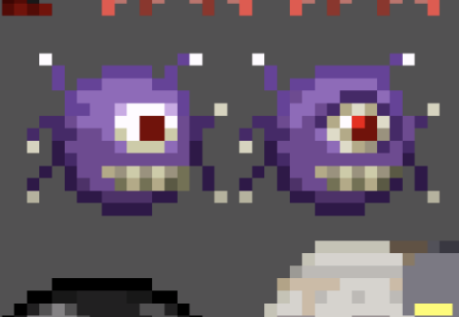
The Yog-Dzewa texture and Goo having teeth are 2 out of 3 things I don't like abt the respeite, lol. Third being Evil Eye.

[–] TropicalDingdong 6 points 3 months ago* (last edited 3 months ago)

Story is on par with bg3

[–] Pickyfan 6 points 3 months ago

The new art looks absolutely gorgeous and I feel like it's the perfect next step for this game.

I do think there are a few nitpicks, but I completely understand that this is all just WIP

I can't tell what the succubus new top is supposed to be 🤔

Also please don't give rats teeth, the cute design of the rats is just as iconic as some of the characters.

Every time you win the game you have a little rat buddy with you

[–] polyduekes 5 points 3 months ago (2 children)

so it was actually a fun read but i would like to say something since you have asked for feedback, while i really appreciate your attempts at trying to polish the game but that doesn't look attracting idk how to describe it but those new designs look like they lack the shine the old designs had or in another words i think they look too much overpolished, it might be just a me thing though or my brain being conservative or something but the polish of the new designs just don't look fitting for this game to me, hope you don't take my words in a bad way

[–] [email protected] 3 points 3 months ago (1 children)

To contrast this, I like the designs. So it will be very much a question down to individual taste, just like the move to 2.5D of the level designs.

I am wondering if Evan is considering a toggle to enable old designs as well, e.g. you can select between classic and modern design. But this would of course bring problems downstream with further new content where he now has to implement two different design styles, so probably won't happen.

[–] 00_Evan 3 points 3 months ago

Afraid I'm not ever going to add toggles to turn off new content added in updates, although I do want the new visuals to satisfy as many people as possible.

[–] 00_Evan 3 points 3 months ago (1 children)

Not at all, thanks for the feedback! I appreciate that the new visuals are a change no matter what. and it'll feel a bit weird to imagine only some new visuals in the game mixed in with the old ones. In the future I might be able to show an example of a game screen with 100% new graphics.

[–] polyduekes 1 points 3 months ago

ohhh, now that you say that, the mixed visuals might be the reason of why i feel them being not fitting,true a game screen with all the new graphics might change the perception i have

[–] [email protected] 5 points 3 months ago* (last edited 3 months ago) (1 children)

Awesome stuff! I remember when development stopped on Pixel Dungeon all those years ago, and Shattered stayed on my phone after trying out the myriad of variants (Sprouted anyone?).

If you'd indulge me, I'd be very interested to hear your thoughts on a few things:

  • Equipment degradation - This being one of the last features that watabou implemented before halting the project always seemed kind of extreme to me. What do you think about the mechanics of it, and do you think it could have been improved upon, if development had not ended? Have you tested with it much in development for Shattered?

  • The other projects from watabou have been pretty cool to see. His proc-generative skills have really shone with the TTRPG tools, and I have actually used them in my own campaign, to some extent. Just wondering if you have checked them out.

  • Any aspirations of starting something new, or is it SPD from here on?

Thanks for sharing your gift to the world! It's helped me pass countless hours enjoyably.

[–] 00_Evan 9 points 3 months ago (1 children)

Thanks for the kind words! I'll answer your questions in order:

  • It's interesting that you mention this because you're already playing with 'improved degradation'! The changes I made in v0.4.0 with strength scaling, and subsequent adjustments in updates like v0.4.1 and v0.8.0 are sort of my version of the degradation system. I think the goal of the system was good, nerfing the 'dump every upgrade into the first high-tier weapon and win' strategy, but there was too much collateral damage. I solved the problem by making it harder to access high-tier gear early, and generally making raw offense with no planning or strategy much less effective.
  • I have checked then out! I don't really have a use for procgen tools myself, but I do keep tabs on what Watabou is doing. Amusingly, a D&D campaign I was in a couple years ago did actually make fairly regular use of Watabou's medival fantasy city generator.
  • I do have some plans, obviously I can't keep working on Shattered forever, but for the foreseeable future I still have ideas for Shattered and the game is doing way too well for me to consider stopping development.
load more comments (1 replies)
[–] LocalDreamerZoe 5 points 3 months ago (1 children)

I'm kind of iffy about most of these. The simpler textures are better imo, all the extra colors on the new ones make them feel too complicated (and round, if that makes sense)

Goo with teeth looks great, but doesn't really fit from a lore perspective. Maybe change it so the teeth are made from broken rock? Seems like that would fit better thematically

A few that stuck out to me; corruption wand feels top-heavy, crystal chest is a bit too transparent, rings look like spaghetti-o's. Gnoll scouts look like wax figures, and monks look too similar to senior monks imo. The bright orange is the easiest tell. Seeds and dewdrops, please just don't. Massive downgrade for both

Evil eyes just look traumatized lol. Would be cool for april fools

DM-300 and mimic redesigns are both great. I'd love to see more like that

Finally, Yog-Dzewa. That sprite is absolutely phenomenal and I cannot wait to plunge an arrow directly in the pupil!

[–] [email protected] 2 points 3 months ago

yuh i agree with these suggestions. esp evil eyes and seeds+dew drops

[–] CrayonRosary 4 points 3 months ago* (last edited 3 months ago)

If you go with a scary mimic you gotta change the laugh to something more sinister! Maybe just a deeper pitch, but that's what ebony mimic has. It really needs an freakish laugh for such a grisly graphic.

BTW, I've always thought that the mimic should not laugh if you directly hit it from far away with a ranged weapon or wand. He should groan out an "Ohh", instead. 😄

[–] Ecuddi97 4 points 3 months ago

In the journal log "The Thief's guild" it says that they were working together with the thief's I guess it'd be cool to see that in the game maybe the rouge can somehow make them friendly or add a quest you can get from one thief.

[–] polyduekes 3 points 3 months ago

whew, this is gonna be a fun read

[–] [email protected] 3 points 3 months ago* (last edited 3 months ago) (1 children)

My two cents:

  • new dagger ressemble too much new sword. Same with fishing spear and middle spear
  • (personal taste) hammerhead is too big.
  • big shield red I find a bit too dim.

  • golden and Cristal mirmics have centered locks!
  • artefacts timer and eye could be viewed 1 pixel more from the front to reduce size of sides.
  • I'm in love with the bland fruit

  • Top of walls seem slightly too bright
  • great sewers (and loved the last update on level gen)

  • mirmic, succubus and also robot have too many details

  • goo has a mouth, not my style

  • robot seems out of theme. Too harsh and steely. Maybe use a bit of bronze ?

  • New yog is top!

  • older necromancer could find a place as ghost invocation necromancer.

  • new ~~character~~ hero blend too much on background - also bad for people with sight issues.

[–] [email protected] 1 points 3 months ago

yesss new heroes defs blend too much

[–] Drawtolife 2 points 3 months ago

New visuals are 10/10 lets go!

[–] Nimpja 2 points 3 months ago

Dont forget to add more badge!

[–] Riversedgeknight1 1 points 3 months ago

I see that the new yog sprites are animated, will we also get new animations for it summoning mobs and charging it's laser attack?

[–] [email protected] 1 points 3 months ago

ayyyyy congrats!! thx for always keeping us in the loop :) i like the new yog, indifferent about everything else except the main characters. the new designs look too muddy. the outlines on the original are much stronger

[–] Hello7251 1 points 3 months ago

Most if not all of the item changes look really cool! For the characters they don't overall look better or worse in my opinion, it just looks different which isn't a bad thing.

[–] [email protected] 1 points 3 months ago (1 children)

I love the new succubi! The old succubi have always seemed like creepy 8-year-olds to me.

[–] Ghostie69 1 points 3 months ago

I too love succubi

[–] [email protected] 1 points 3 months ago

Holy fuck graphics were my only critique to to his game now is improving? On your way to 10 outta 10.

[–] Max_Overton 1 points 3 months ago (1 children)

This looks and sounds really rad, some changes I like more than others but overall this seems super cool and really sets Shattered PD as it's own project (even moreso than it already does!). Plus I can't be mad when a developer of a game I love continues to give such awesome content to us a decade down the line! Thankyou for all your hard work over the years.

Also I had just one question, when you overhaul the chests and mimics, will there still be a slight visual detail (mimic has a lower chest lid/lock) to be able to tell what's a mimic and what's a normal chest? I felt really awesome when I noticed it and love using it to make fights with mimics a bit more strategic if possible (without waiting for the tongue animation)

[–] 00_Evan 1 points 3 months ago

Glad to hear you like the new art! There isn't a specific plan when it comes to mimics visuals, but yes I would like to preserve the current tells in roughly the same form.

[–] Cadeillac 1 points 3 months ago* (last edited 3 months ago) (4 children)

Is someone willing to convince me to play this? I already have it installed on my tablet (only thing I have right now). Also, maybe a couple tips to get me going? I enjoy rogue lites, but haven't really delved into rogue likes so far

Edit: yeah, it's a real good time. Seems to be a fine entry level rogue like as far as I can tell. Took a few runs just to make it to the 3rd floor, but it just makes me want to keep trying. Definitely worth giving a go just to see

[–] cevn 5 points 3 months ago (1 children)

Just play for 30 minutes and see if you can stop, lol.

[–] Cadeillac 1 points 3 months ago

I'll have to give it a go then. Thank you for replying

[–] [email protected] 4 points 3 months ago (1 children)

Dude, it's so good. I picked it up a year or more ago and haven't put it down. I didn't 'get it' at first, but I read a lot of the in game text and it got me up and running

The biggest tip is that strength what allows you to use other pieces of gear. If you don't have enough strength you are heavily penalized on how that gear performs.

[–] Cadeillac 1 points 3 months ago

Awesome, thank you so much! I'll give it a try later. I started this ROM hack of Banjo-Kazooie in Ocarina of Time in honor of the site no longer hosting files. It has my attention at the moment

[–] ace_garp 2 points 3 months ago (1 children)

Yes, it is the complete package of a game, and ever evolving. Play it.

Draw enemies through a door, and wait close on the otherside to surprise attack them. This will reduce around 50% of the damage you would take normally.

[–] Cadeillac 2 points 3 months ago

Thanks for the tip! I was having a hard time with taking damage. I'll probably do a couple runs sometime tonight. Picked up a couple of board games to play with the partner, so I've gotta play at least one of those. (Just realized I've finished dinner and they haven't. Time to sneak in a run or 10)

[–] [email protected] 2 points 3 months ago

I don't usually like roguelikes, but this one has me hooked.

[–] Vencedor 1 points 3 months ago (1 children)

The Sad Ghost, the Necromancer and DM-300 look brutal. The other sprites look good, nothing big. The Evil Eye and Yog-Dzewa look uncanny... Not the good way, tho... I could be used to new Yog-Dzewa, but the Evil Eye just looks so.. weird. And I don't like Goo having a mouth... Wasn't it's whole deal that it was, and I quote: " a conglomerate of vile substances from the sewers that somehow gained basic intelligence."? That shouldn't have teeth!

[–] CrayonRosary 1 points 3 months ago (1 children)

Yeah, the Evil Eye's eye socket has too much shading.

[–] Pickyfan 1 points 3 months ago (1 children)

I thought that was eyelids

[–] CrayonRosary 2 points 3 months ago* (last edited 3 months ago) (1 children)

Well, sure. It's the combination of the two. It's just too much contrast.

Looks like it's wearing eyeliner.

load more comments (1 replies)
load more comments
view more: next ›