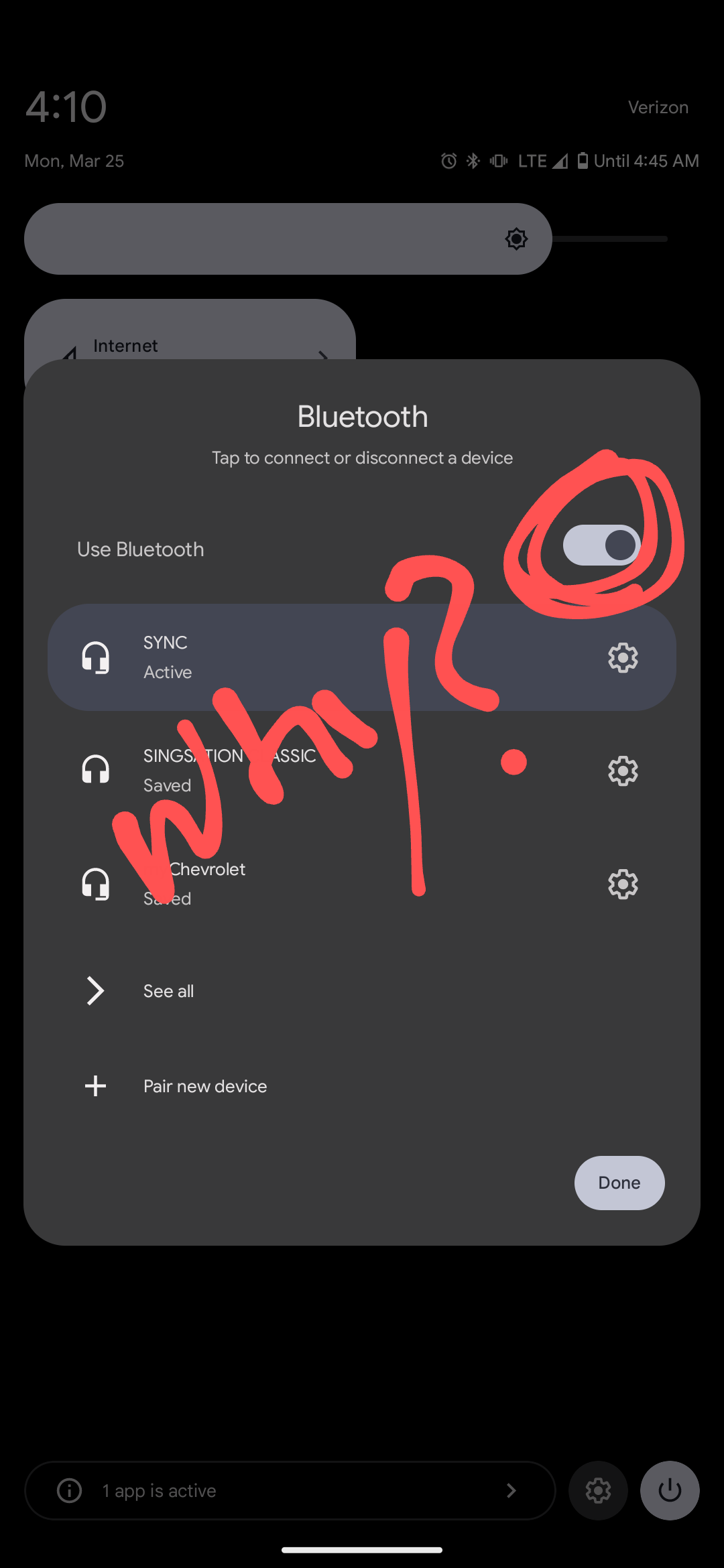
I don't like it, but I like it more than the old way of holding the button down to get to the menu. I do hate that the "see all" menu doesn't just expand the current menu, it takes you to the old menu. There's definitely hints of windows95 creeping into Android.
Android
DROID DOES
Welcome to the droidymcdroidface-iest, Lemmyest (Lemmiest), test, bestest, phoniest, pluckiest, snarkiest, and spiciest Android community on Lemmy (Do not respond)! Here you can participate in amazing discussions and events relating to all things Android.
The rules for posting and commenting, besides the rules defined here for lemmy.world, are as follows:
Rules
1. All posts must be relevant to Android devices/operating system.
2. Posts cannot be illegal or NSFW material.
3. No spam, self promotion, or upvote farming. Sources engaging in these behavior will be added to the Blacklist.
4. Non-whitelisted bots will be banned.
5. Engage respectfully: Harassment, flamebaiting, bad faith engagement, or agenda posting will result in your posts being removed. Excessive violations will result in temporary or permanent ban, depending on severity.
6. Memes are not allowed to be posts, but are allowed in the comments.
7. Posts from clickbait sources are heavily discouraged. Please de-clickbait titles if it needs to be submitted.
8. Submission statements of any length composed of your own thoughts inside the post text field are mandatory for any microblog posts, and are optional but recommended for article/image/video posts.
Community Resources:
We are Android girls*,
In our Lemmy.world.
The back is plastic,
It's fantastic.
*Well, not just girls: people of all gender identities are welcomed here.
Our Partner Communities:
I Fucking Hate It!
I think however this is just based on how the average user interacts with this toggle. Very few users actively turn off their BT, ever, as they have frequent situations where they want their BT to just work immediately.
OTOH, this means that in some cases, they need to swap which device to connect to, hence opening the menu on the first tap.
this entire quick actions shade was redesigned either for children or for elders
the space now used for 4 quick actions could fit 12 quick actions before
They need to add a way to quick toggle it, maybe a double tap or hold.
This is part of why is think stock android is now trash. I'll stick to oem skins for now
I thought this was only on graphene, as a way to confirm your wanted Bluetooth radio turned on. As a general Android update, it makes no sense
